Checkout Funnel Drop-Off Analysis for DTC Shopify Stores
Diagnose which funnel stage is leaking before you redesign anything.
Checkout drop-off in a DTC Shopify store comes from four distinct leaks, and most stores treat it as one problem instead of four. That mistake costs real money: a merchant who spends three weeks redesigning checkout when the actual bleed is happening on the product page has wasted three weeks. The fix requires a targeted diagnosis of which stage is leaking, how badly, and in what order to patch it. It's finding which stage is leaking, how badly, and in what order to patch it.
The 2 to 3% average conversion rate quoted everywhere is close to useless on its own. It says nothing about whether shoppers are bouncing off the product page, abandoning the cart, or dying somewhere in the checkout form, and it ignores price point almost entirely, even though price point shifts the conversion rate itself, as the 21-store dataset comparison that follows shows. A 21-store dataset from dtcpages.com found stores under $60 average order value convert at roughly three times the rate of stores above $200 AOV. Comparing a low-priced skincare brand's conversion rate to a furniture brand's tells you about two different shopping behaviors, not two performances of the same task, so the comparison itself is close to meaningless.
Sessions rising while conversion rate falls doesn't mean a store is getting worse, either. It usually means the traffic mix shifted toward earlier-stage, less-ready buyers, a pattern the same 21-store sample showed happening between Q1 2025 and Q1 2026. Read that as a traffic-quality signal about the store. Find the stage, measure the leak, match a fix to that stage. A checklist run top to bottom won't do it.
Reading your own funnel data before touching anything
Before any benchmark comparison means anything, a store needs a clean read on its own numbers. Shopify Analytics ships a checkout funnel report on every plan, and running it against a GA4 funnel exploration is worth doing early, since the two platforms don't define "session" or "conversion" the same way and the gap between them can throw off every decision downstream.
Four stages need separate tracking, not one blended rate: online store sessions to product page views, product page views to add-to-cart, add-to-cart to checkout initiated, and checkout initiated to purchase completed. Dynamic Yield's rolling benchmark puts a healthy product-page-to-cart rate around 6.08%. A July 2025 to June 2026 dataset from Top Growth Marketing, tracking 423,978 checkouts across 16 DTC Shopify stores, found median checkout abandonment at 34.9%. Those are two different problems with two different fixes, and a blended rate hides both of them at once.
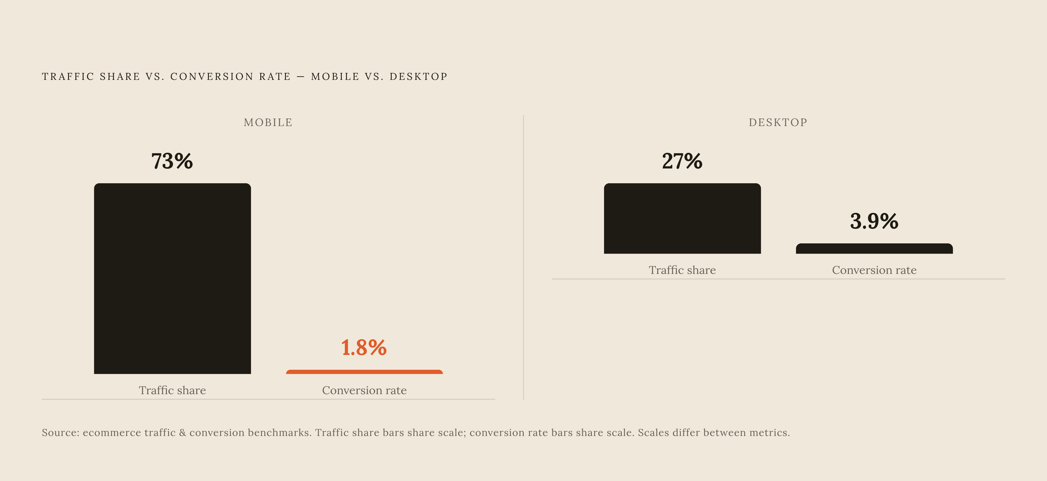
Device segmentation isn't optional. Mobile makes up roughly 73% of ecommerce traffic but converts at about half the rate of desktop, so a funnel report run without a device split will misread a mobile-only problem as a store-wide one. Traffic source causes the same distortion. Blog readers and paid-ad clickers landing on the same product page produce an average that describes neither group.
Shopify's own conversion reporting and whatever ROAS number a paid ad platform reports back will not match. Settle on what "conversion" means inside the store's own analytics before crediting any single fix with an improvement, or the store ends up chasing a number two systems define two different ways.
Product page drop-off: when shoppers leave before they ever reach the cart
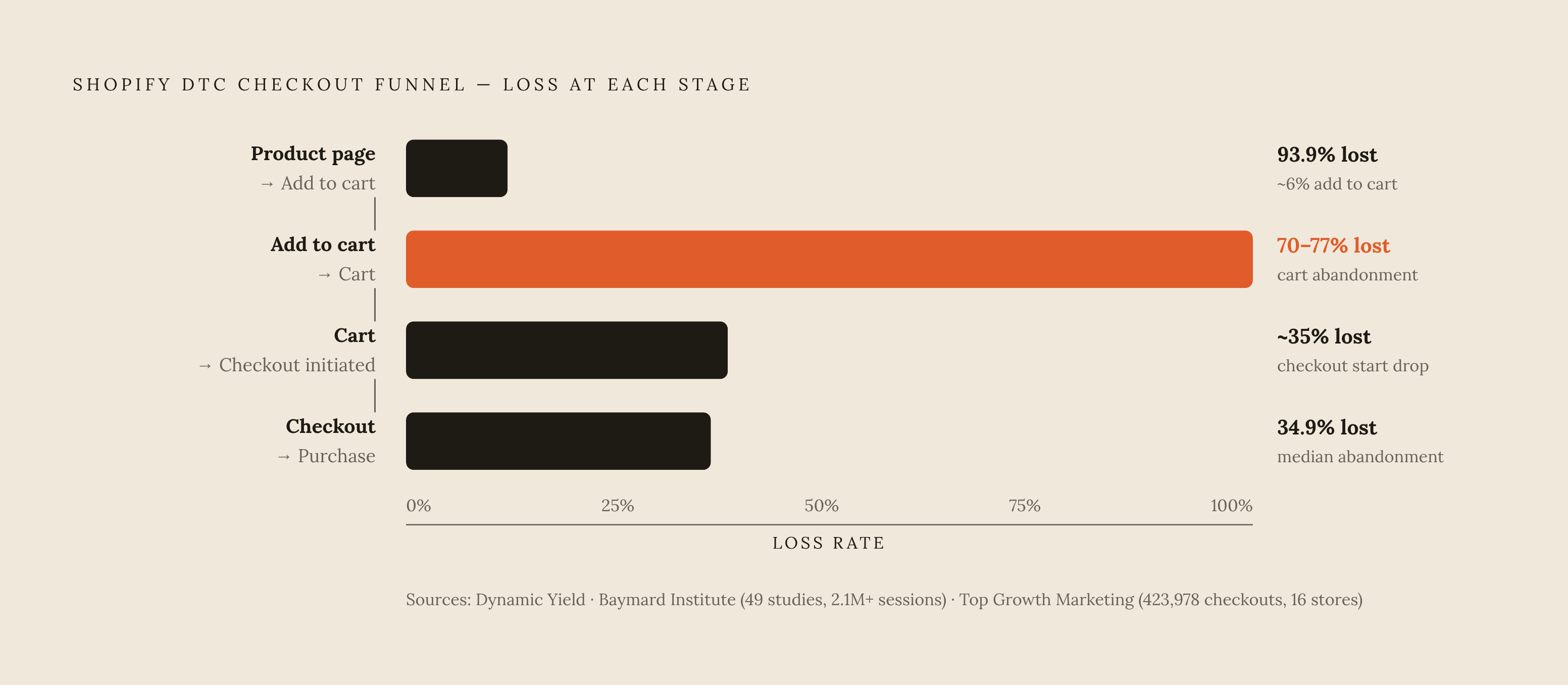
An add-to-cart rate well below that 6.08% Dynamic Yield benchmark means the problem sits upstream of checkout entirely. No checkout redesign moves this number. None.
The usual suspects: product descriptions too thin to answer a shopper's real question, images that don't resolve doubts about scale or texture or fit, no reviews visible without scrolling, and pricing shown with no context, no installment option, just a number that triggers sticker shock before the cart even opens. Page speed belongs on this list too. Akamai found every 1-second delay costs 7% in conversions, and that penalty hits product pages just as hard as checkout pages.
The $100 to $200 AOV bracket deserves its own line. The dtcpages.com data shows add-to-cart rates drop sharply in this range compared to sub-$60 products, because shoppers here browse across three or four sessions before they commit. A product page selling into that bracket has to answer the questions a shopper accumulates over multiple visits.
Thin, unstructured product descriptions fail human shoppers and AI shopping tools in the exact same way: neither one can answer a question the data doesn't contain. Enriched attributes, exact sizing, compatibility, ingredients, intended use, close the "I still have a question" exit before it opens.
Delugs, the watch strap brand, built a Strap Finder tool on Shopify metaobjects to help shoppers match straps to their watches before adding to cart. The result was a 58% year-over-year increase in checkout conversion, and the tool never touched checkout at all. It worked by cutting pre-cart uncertainty, which is the actual mechanism worth copying. Fix information gaps and page speed before spending an hour on cart or checkout copy. Moving downstream first just wastes the effort.
Cart abandonment: the 77% problem and what drives it
Cart abandonment dwarfs every other stage. Dynamic Yield puts the average at 77.68%. The Baymard Institute, drawing on 49 studies covering more than 2.1 million checkout sessions, landed at 70.9%. Either number makes checkout-stage friction look small by comparison, and that's exactly where most merchants get the priority order wrong.
Baymard's own data shows a large share of shoppers who abandon are simply browsing and not ready to buy. No UX fix recovers that share, full stop. Treating the whole 70-plus percent as recoverable opportunity is the fastest way to burn a fix budget on the wrong shoppers.
What's actually recoverable is narrower, and Baymard names the specific reasons. Unexpected shipping costs top the list, cited by 48% of abandoners as the primary reason for leaving: the single largest fixable driver in the entire funnel. Cost opacity costs another 14% (shoppers who leave because they can't see the total price before committing), return policy uncertainty accounts for 15%, and payment method gaps take a further, meaningful slice.
The shipping-cost fix is simple and belongs earlier in the flow than most stores put it: show shipping cost and an estimated total on the cart page itself, not at the final checkout step, using a shipping calculator or a free-shipping progress bar. Surfacing shipping costs on the cart page rather than at the final checkout step is a straightforward way to reduce abandonment downstream, addressing the single largest fixable driver Baymard's data identifies. Return policy should sit on that same cart page too, not buried behind a footer link three clicks away. If 15% of shoppers are leaving over policy uncertainty, hiding the policy is the problem, not the policy itself.
Global revenue lost to cart abandonment is estimated at $4.6 trillion annually as of 2026, though that number folds in the 43% who were never buying anyway, so treat it as a scale indicator and not a recovery target. Email remains the standard rescue mechanism for whatever portion is recoverable. Klaviyo's sequence guidance suggests abandoned-cart flows recover somewhere between 5% and 15% of abandoners, but that's cleanup after the fact. It doesn't prevent the abandonment in the first place.
Checkout friction: the specific barriers that kill committed buyers
Checkout abandonment is a different animal from cart abandonment. A shopper who reaches checkout has already decided to buy, so losing them here costs a real customer, not a browser who was never converting anyway.
That 34.9% median checkout abandonment figure from Top Growth Marketing's 16-store dataset is mostly fixable friction, and the gap between median performance and the top decile comes down almost entirely to UX and trust work. Forced account creation is among the most-cited drivers in Baymard's research. The fix takes minutes: enable guest checkout under Settings, then Checkout, then Customer contact method. Yet Baymard's research found many sites still fail to make guest checkout the visible default, burying it behind an account-creation prompt shoppers have to actively decline.
Trust breaks down at the payment step specifically. Baymard's data shows 17% of US shoppers abandon checkout because they don't trust the site with their card details. Visible SSL indicators, recognized payment logos, and security badges near the payment form address this directly, and wallet options like Apple Pay, Google Pay, and PayPal do double duty here, working as trust signals as much as shortcuts.
Form length is its own tax on completion. Baymard's research shows most US checkouts carry far more fields than the transaction needs, and a significant share of those fields can disappear without losing any required information. Merging first and last name into one field, hiding optional fields behind a link instead of showing them by default: small edits, outsized effect on a mobile keyboard.
A legal dimension is developing here too. Abercrombie & Fitch faced a class-action suit, Heilman v. Abercrombie & Fitch Co., filed in March 2026, over a shipping and handling fee that stayed hidden until the final checkout screen. Drip pricing has grown from a UX complaint into a liability problem.
Shopify rolled out one-page checkout to all merchants in late 2023, collapsing a multi-step flow into a single screen. Stellar Eats switched to it and saw a 3.5% conversion lift, projected to add tens of thousands of dollars in revenue over the following two years. At the far end of the curve, Shopify Enterprise data tracking 280 top-decile merchants over 18 months found stores combining express checkout, Shop Pay installments, and post-purchase upsells reaching 71.3% checkout completion, well clear of the 34.9% median.
Payment method selection as a conversion lever, not an afterthought
Digital wallets took 56% of global ecommerce spending in 2025, according to Worldpay, ahead of credit cards at 20%, with wallet share forecast to grow roughly 10.2% annually through 2030. Payment method stopped being a backend settings decision a while ago. Treat it as a front-line conversion lever, because that's what the numbers say it already is.
Shop Pay converts at a rate 50% higher than standard guest checkout, according to Shopify's own numbers. Everlane added it in late 2023 and within 30 days saw 15% of US transactions running through Shop Pay, demonstrating the kind of lift that matters most for stores working to convert hesitant buyers.
The mechanism is plain: pre-filled shipping and payment details cut checkout down to under 30 seconds, and cutting manual data entry removes the single largest source of mid-checkout abandonment on mobile. Buy-now-pay-later works a different angle. Affirm's internal 2025 data shows offering four-installment BNPL at checkout raises average order value by 28%, a lever that matters most for stores that are in that $100 to $200 consideration-gap bracket.
The mobile-payment mismatch deserves its own line: mobile traffic converts at roughly 1.8% against desktop's 3.9%, a gap built largely from payment UX designed for a keyboard and mouse, not a thumb. Wallet-based checkout closes that gap by eliminating manual data entry and navigation steps that create the most friction on a small screen.
Recognizable brands still do real work here. PayPal's widespread familiarity among US online shoppers cuts directly against the 17% trust-related abandonment Baymard measured. Shop Pay, Apple Pay, Google Pay, and PayPal belong above the fold as accelerated buttons, not buried below the standard form where they stop reducing friction at all.
The mobile checkout gap that most stores still haven't closed
The numbers make the case on their own: 73% of traffic arrives on mobile, and it converts at 1.8% against desktop's 3.9%. Most of a store's audience is converting at less than half the rate of the minority, and that's not a rounding error.
Mobile amplifies every friction point already covered. A multi-page checkout that's mildly annoying on a laptop turns disorienting on a five-inch screen, where every page transition is a fresh chance to bail. Manual form entry on a mobile keyboard raises error rates and makes the process feel heavier than it is. Trust badges sitting comfortably in a desktop sidebar often fall off-screen entirely on mobile. Slow-loading product images can stall a shopper before they even reach the cart.
Most Shopify themes still get built desktop-first and adapted down to mobile afterward, which is backwards given where the traffic actually sits. Design for the phone, then adapt up, not the other way around. One-page checkout and wallet-based payment buttons do disproportionate work on mobile specifically, because they cut out navigation steps and keyboard entry, the two most expensive frictions on a small screen.
None of this appears in a blended, device-agnostic conversion number. Shopify Analytics supports device-level funnel segmentation, and a store that skips it has no way to locate where its mobile leak actually sits. Page speed carries extra weight here too: the 7% per-second conversion penalty Akamai measured applies across devices, but mobile connections vary more, so image compression and deferred scripts matter more on a mobile checkout path than a desktop one.
How AI-powered on-site conversation changes the drop-off equation
Most of the upstream causes covered here, unanswered product questions, size or compatibility doubts, unclear return policy, are information problems at heart. A faster checkout button does nothing for a shopper still stuck on whether a strap fits their specific watch model.
On-site AI conversation sits right at the point where that gap opens, on the product page and in the cart, before checkout ever enters the picture. It catches the "I still have a question" exit at the exact stage where it happens, instead of trying to win the shopper back after they've already left.
There's a second benefit that gets less attention: the questions shoppers actually ask an on-site AI reveal which product attributes are missing from a description, which policy language reads unclear, and which objections repeat across a category. That's catalog feedback arriving in real time, not guessed at after the fact.
The quality of that conversation depends entirely on the quality of the catalog feeding it. A brand-trained AI working from enriched, structured product data, attributes, compatibility specs, ingredient lists, real reviews, can compare SKUs, recommend based on a shopper's stated need, and explain a return policy in context. A generic chatbot routing every question back to a static FAQ page can't do any of that, and the gap between the two is a difference in kind. It's a difference in kind.
Training one intelligence on the full catalog and running it consistently across product page, cart, and checkout, rather than stitching together separate tools with separate answers, avoids the worst outcome here: a shopper getting one answer on the product page and a contradicting one in a cart-side chat. Inconsistency at that stage doesn't just fail to fix the drop-off. It hands the shopper a brand-new reason to leave.