Above-the-Fold Copy Sequencing on DTC Landing Pages
The order of copy on DTC pages matters more than the copy itself.
A visitor lands on a DTC page and decides, within seconds, whether to keep reading or leave. The order of the copy decides that outcome more than the copy itself: outcome, credibility, offer, call to action, in that sequence, every time. Get the sequence wrong and no amount of polish on the individual pieces saves the page.
The fold itself moves depending on the device. On a laptop it runs roughly 600 to 800 pixels; on a phone held upright, closer to 400 or 500. Visitors spend around 11 seconds above that line on desktop and about 7 on mobile before they scroll, click, or leave for good. Most never read far enough for the rest of the page to matter: research consistently finds that the large majority of landing page visitors take in only the headline and the first sentence of the subhead before they decide the page has earned any more of their time. That first viewport has to answer four questions on its own: what is this, why should someone care, can this be trusted, and what happens if they act. Fail any one of those and everything below the fold stays theoretical, unread and unweighed.
Outcome leads, not features, not a brand story, not a logo parked at the top because someone in a meeting decided the page needed one. Outcome leads because of what a visitor is actually doing when they land. Nobody clicks through to a DTC page out of curiosity about a company's history. They arrive with a problem they want solved or a version of themselves they want to become, and the headline's only job is to name what changes for them. What the product is matters far less than what it does to their situation in the next five minutes, five days, or five months.
Credibility comes before the offer, and the ordering isn't arbitrary. A visitor who hasn't decided to trust the source registers doubt before forming any objection to the discount. If a discount code is put in front of someone who hasn't made that call yet, they read it as a gimmick, not a deal. Trust has to be settled, even provisionally, before price enters the conversation.
That's also why the offer sits third and not first. Once the outcome is clear and the source feels legitimate, a discount reads as a reward for showing up. Lead with the discount before either of those things gets established, and the same discount reads as proof the brand needs the sale more than the customer needs the product. Brands that flip this order tend to blame the offer when the real fault sits two beats earlier, in a headline or a trust signal that never landed.
Writing the outcome headline: specificity over category claims
Category claims are the first thing to cut from a draft, not the last. A Popupsmart audit found that a headline like "Inventory management for restaurants that hate spreadsheets" beats something like "The future of restaurant tech" by a wide margin. One names a person, a frustration, and a fix. The other names a category nobody asked to join.
Generic claims have gone invisible. The same audit, drawn from over 2,000 pages of tested copy, found that phrases like "trusted by thousands" now perform at a level statistically indistinguishable from having no social proof on the page. A decade of marketing copy has trained readers to skip past vague superlatives without registering them. The words sit there, doing nothing.
What moved the needle in that study was the single-stat hero: one concrete, specific number sitting inside the headline, lifting conversion by 18% over every other hero pattern tested. "127 times faster than legacy systems" beats "blazing fast" or "next-generation performance" because it gives the reader something to check against their own situation. Anchor the outcome headline to a measurable result, a named use case, or a specific transformation. Cut the adjectives first, not last, since they're the part doing the least.
Placing credibility: what trust signals belong above the fold
Trust signals belong above the fold, close to the call to action, because their job is narrow: answer "can this be trusted" before the visitor consciously forms the objection.
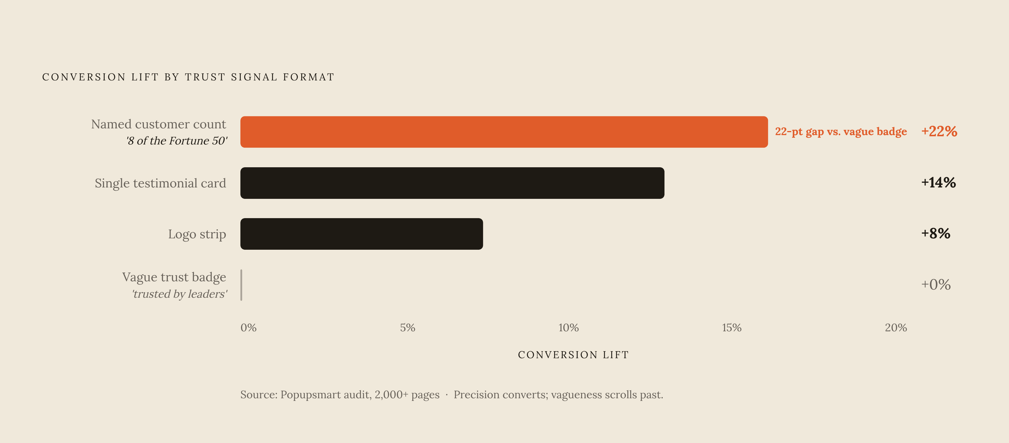
Specificity does the same work here that it does in the headline. The Popupsmart audit found named-customer counts with real context, something like "used by 8 of the Fortune 50," lifted conversion by 22%. A single, well-placed testimonial card lifted 14%. A logo strip, on its own, lifted 8%. Vague trust badges reading "trusted by industry leaders" landed at noise level, no better than no badge. Precision converts. Vagueness gets scrolled past, in every format tested.
Star ratings paired with review counts remain the standard DTC trust signal, for a specific reason: the stars themselves don't do the work. The number sitting next to them does, provided it reads as a real, checkable figure rather than a rounded-up abstraction like "4.8 stars from happy customers."
Founder presence has become its own trust signal, and a sharper one than it used to be. DTC brands that put a founder's face and voice front and center see meaningfully higher conversion than pages built around faceless product photography. That gap persists at a moment when shoppers are increasingly alert to AI-generated copy and stock imagery. A founder's presence signals that a real person stands behind the claim, at a moment when that reassurance is harder to find anywhere else on the page.
Framing the offer: how to present the deal without undermining trust
The offer needs to be visible above the fold on the smallest screen in a brand's traffic mix, which for most DTC operations means a narrow mobile viewport. If the discount or the free-shipping line requires a scroll to find, it isn't doing its job.
Placing the offer after credibility changes how the discount reads. The visitor has already decided the brand is legitimate, so the discount reads as an incentive to act now, not a hint that the brand is struggling to move product.
Genuine low-stock counts and sale countdowns that actually expire convert well, because they're true. A countdown timer that doesn't reflect a genuine deadline undermines trust, because it signals to returning visitors that the urgency was manufactured rather than real. That lesson sticks harder than whatever discount prompted it, and it's expensive to unteach once learned.
Cross-border DTC brands run into a related trap: currency. Forcing a shopper to hunt down a country picker just to learn what they'll actually pay creates friction exactly where credibility was supposed to be building.
The CTA: one button, the right words, the right position
One button. Not two, not three. Research consistently shows that landing pages built around a single call to action convert at a meaningfully higher rate than pages offering multiple competing buttons. The reason tracks with basic decision psychology: fatigue sets in before the visitor has even scrolled once.
Wording matters almost as much as count. "Start free," "Get the deal," "Shop the sale": these outperform vague, low-commitment phrasing like "Learn more" or "Submit," because they describe the outcome of the click rather than the mechanics of clicking it.
The most counterintuitive finding concerns where the CTA's real work happens. The 2,000-page A/B study found sticky-bottom CTAs, the kind that follow a visitor down the page as they scroll, deliver an 11% lift on their own. Adding an above-fold CTA on top of that sticky bar adds only about 1% more, a combined 12%, not the additive lift most conversion playbooks assume when they treat every CTA placement as independently valuable.
That finding reframes what the above-fold button is actually for. It functions as a secondary exit ramp, catching visitors who arrived already convinced, maybe from a referral, an ad, or a recommendation somewhere else. The sticky CTA picks up almost everyone else. Both need to exist, but design effort spent forcing the above-fold button to do more than that narrow job is effort spent solving the wrong problem.
Mobile stacking: how the four-beat sequence changes shape on a phone screen
A substantial majority of DTC traffic now arrives on mobile, and mobile conversion still trails desktop by a meaningful margin.
The four-beat sequence doesn't disappear on a phone, but it restacks. Headline first, still carrying the outcome. Hero visual next. Then the CTA button. Then the credibility signal. The visual jumps ahead of the CTA in this order because a phone screen forces a tighter stack, and a strong image earns attention faster than a paragraph of text ever will on a screen that small.
Headline compression follows directly from the space constraint: six to eight words, maximum, on mobile. The outcome has to survive with the adjectives stripped out, because there's no room left to keep them.
Build the mobile hero for a 400-pixel-tall viewport first, not last. If the headline, the CTA, and one visual element all fit inside that space, the layout holds, and only then should the design expand outward for desktop. Most teams build it backward: design for the large screen first, cram the mobile version in afterward, then wonder why their mobile bounce rate runs so far ahead of the desktop figure. That's the wrong order, and it is visible directly in the numbers.
Testing above-the-fold copy: what the A/B data says about where to focus effort
Across more than 28,000 A/B tests analyzed in 2026, only 13% reached statistical significance in favor of the tested variant. Another 9% came back as a significant loss. The remaining 78%, the overwhelming majority, were inconclusive.
That number should reshape how a team thinks about testing effort. Teams running scattershot tests, tweaking button colors or swapping a stock photo, burn months of traffic without producing a single usable signal. The teams that consistently get answers focus on the handful of elements that actually drive variance, namely the headline, the hero image, the primary CTA, and form length. Everything else is mostly noise dressed up as a test, and chasing it is how a testing calendar fills up without a single decision getting made.
For the four-beat sequence specifically, that means testing the outcome headline and the credibility signal first, since they carry the highest variance above the fold. Testing offer framing or CTA copy before those two are settled brings back a result contaminated by variables that were never going to be clean.
One finding cuts directly against a popular assumption: video heroes lose an average of 7% in conversion, mostly because slower load times, specifically a degraded measure of how quickly the main content renders, eat into whatever engagement the video itself generates. The instinct that video always converts better doesn't hold up above the fold. Test it before committing production budget to it, not after.
How AI shopping channels are reshaping above-the-fold copy
Adobe Analytics recorded a sharp year-over-year jump in traffic to US retail sites arriving from generative AI tools between July 2024 and July 2025. A growing share of DTC traffic now arrives pre-filtered, having already passed through an AI agent's recommendation before it ever touches the landing page.
That shift changes what the above-the-fold copy is actually for. Tools like ChatGPT, Google AI Mode, and Perplexity read data, not layout or design polish, and a visitor who clicks through from one of these has typically already heard some version of the outcome and the trust signal from the agent itself. Above-the-fold copy in that scenario is confirming what the visitor already heard somewhere else. Message match now has to extend upstream, into whatever the AI surface said, not just downstream into the page.
One major platform's latest seasonal release pushed this further by deepening assistant-driven commerce as a core feature. On Google AI Mode and Gemini, a shopper can complete a purchase without leaving the conversation, bypassing the storefront. On ChatGPT, the flow still redirects the buyer to the brand's own checkout, and on that particular path, the above-the-fold sequence, outcome, credibility, offer, CTA, still has real work to do.
That split creates a genuine attribution problem. When a purchase happens inside an AI conversation rather than on-site, it falls outside the funnel dashboards most DTC teams still rely on. Above-the-fold copy can no longer be judged purely by on-site conversion numbers, because a growing slice of the funnel now happens somewhere the analytics platform simply can't see. Brands that keep measuring success only by what their own site logs report are already missing a piece of the picture, and that piece is only going to grow.