Subscription vs One-Time Purchase Toggle UX on DTC Sites
Shoppers fear subscription toggles because they can't assess price and trust simultaneously.
What shoppers are afraid of when they see a subscription option
Two things go wrong the moment a shopper looks at a subscription toggle. They can't tell what they're paying versus saving, and they can't tell what they're actually getting. These aren't separate problems that happen to show up together: the toggle triggers both at once, because the shopper has to judge price and value in the same glance, before deciding whether to commit to anything.
Subscription fatigue is a specific obstacle now, not a vague mood. Households already carry multiple recurring charges across various categories, so every new subscription ask lands on top of a pile the shopper is already half-annoyed about. The question in that moment is whether the shopper wants one more line item on a credit card statement they already dread opening, not whether the product is good. It's whether the shopper wants one more line item on a credit card statement they already dread opening.
Then there's the scar tissue from prior cancellations gone wrong, including a hidden cancel link, a required phone call, and a retention agent trained to stall as long as possible. That memory travels into every new subscription decision, regardless of which brand is asking. A toggle that only sells the entry and says nothing about the exit is asking the shopper to ignore a bad experience they've likely already had somewhere else, and shoppers don't extend that kind of good faith for free.
DTC brands carry a burden here that Amazon doesn't. Amazon earned trust at scale, across millions of transactions, over years. A DTC brand asking for recurring billing access on a first visit is asking for something it hasn't had the chance to earn, so the toggle has to do some of that trust-building work on its own, in seconds, with no track record to lean on. Brands that treat the toggle as a pricing widget rather than a trust instrument are the ones that watch conversion stall for reasons the analytics dashboard can't explain.
The regulatory floor every toggle must clear after the FTC's Click-to-Cancel rule
The FTC's 2024 Negative Option Rule set three requirements that shaped how subscription toggles get built: clear disclosure of material terms, express informed consent before any charge, and a cancellation process no harder to use than signup. That third piece, cancellation parity, forced the most redesign work, because plenty of subscription flows had been built with fast signup and deliberately slow cancellation.
The rule didn't survive intact. On July 8, 2025, the Court of Appeals for the Eighth Circuit vacated it, ruling that the FTC skipped a preliminary regulatory analysis required under the FTC Act. The court found the FTC skipped the correct process to impose the rule. The court never said the underlying consumer protections were wrong. It said the agency skipped the correct process to impose them, which is a very different thing than saying the standard itself was mistaken.
Vacatur didn't mean the FTC walked away. The agency kept enforcing under Section 5 of the FTC Act and a separate consumer-protection statute governing online subscription disclosures, both of which predate the 2024 rule and remain fully in force. By March 2026, the FTC had opened an Advance Notice of Proposed Rulemaking aimed at reviving the rule through a compliant process.
The practical standard, in the meantime, comes from enforcement actions rather than the vacated rule itself. Match.com, Chegg, Cleo AI, and Amazon have all faced FTC settlements or lawsuits tied to negative-option billing practices, and read together those cases draw a consistent line: disclose the terms clearly, get real consent before charging, make cancellation as easy as signup. Brands waiting for a finalized rule before fixing their cancel flow have the situation backwards. The enforcement pattern already tells you what's expected, rule or no rule, and waiting for a federal regulator to finish its paperwork is not a defense that holds up in a settlement conference.
Which product categories justify a subscription toggle
Replenishment is the case where the subscription toggle earns its place without argument. Coffee, pet food, supplements, skincare: these are products the customer was going to reorder regardless, so the subscription doesn't create new demand. It just removes the friction from a purchase decision that was already going to happen on its own schedule.
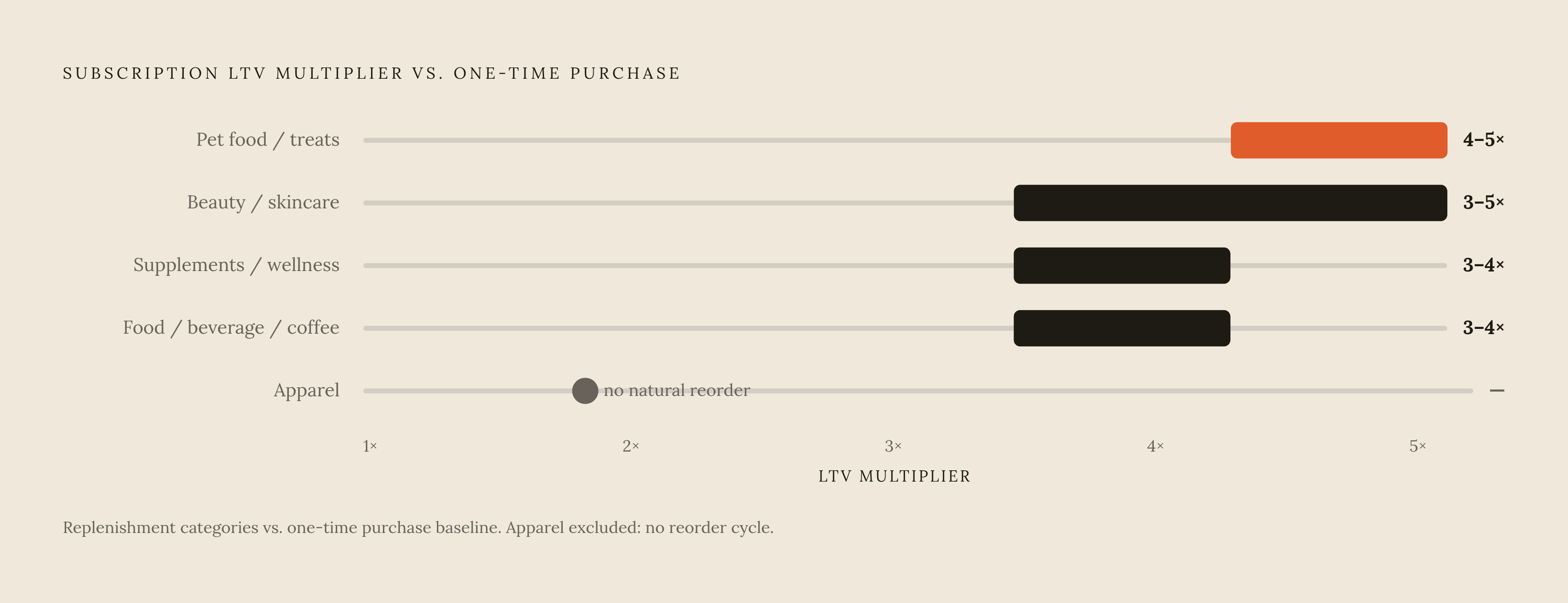
Category-level lifetime value data backs this up with real separation. Pet food, treats, and supplements show subscription LTV running 4 to 5 times higher than one-time purchase LTV. Beauty and skincare run 3 to 5 times. Supplements and wellness run 3 to 4 times, and food, beverage, and coffee are in that same band. Apparel comes in lowest, because clothing doesn't have a natural reorder cycle the way a jar of protein powder does. Apparel subscriptions only work when a curation or styling hook does the job reorder logic does for consumables.
That's also where the toggle should disappear entirely, and most brands are too slow to pull it. High-AOV considered purchases, furniture, electronics, don't fit a subscription model. Gift items don't either, since the buyer and the user aren't the same person. Any product with no natural reorder cycle turns a subscription push into a forced fit, and a brand without real churn infrastructure, no win-back flows, no pause options, no dunning management for failed payments, only makes the damage worse by forcing a toggle onto a non-replenishment category. Early churn ends up looking worse on the books than simply running a one-time purchase flow with a solid reactivation sequence behind it. If a category has to be talked into a subscription model, that's the signal to leave the toggle off the page.
Curation models deserve a separate note, because they don't behave like replenishment even when they look similar on the surface. Discovery box subscriptions, the Birchbox model, carry meaningfully higher churn than replenishment brands: Birchbox has run around 14% monthly churn, compared to roughly 7.5% for a replenishment brand like Dollar Shave Club. The toggle copy for a curation product has to lean on discovery and surprise value rather than savings, because the shopper isn't subscribing to avoid running out of something. They're subscribing to see what shows up next.
Displaying price, savings, and billing terms without triggering abandonment
Confusing price and savings display, and unclear benefit communication, are the two failure modes most often measured in subscription widget research, and both are fixable through disciplined labeling rather than a redesign.
Savings need to show as a dollar figure and a percentage, together. "Save $4, 10% off" tells the shopper what they're giving up by staying on one-time purchase. A price with no visible comparison forces the shopper to do math they'd rather not do, and shoppers who have to do that math tend to abandon rather than sit there calculating it themselves.
Discount depth matters too. Most DTC subscription offers run in the 10 to 15% range, and that band exists for a reason. The 10 to 15% band is where most DTC subscription offers land, and that range reflects where subscription economics have settled across the category.
Billing terms need to surface at the point of toggle selection, not buried at checkout. The first charge date, the renewal date, and the exact billing amount should all be visible the moment someone selects the subscription option. This is the exact point where compliance and conversion design overlap: a shopper who sees billing terms upfront is less likely to feel tricked later, and a brand that discloses upfront sits closer to the standard enforcement actions have already set.
What the toggle must communicate about value beyond the discount
The strongest subscription offers stop treating the discount as the whole pitch, and the ones still leading with percentage-off numbers are underselling what they've actually built. Exclusive access, skip and pause control, early product drops, loyalty credit: frame these as an ongoing exchange rather than a price cut, and the subscription feels less like signing up for a commitment and more like getting value handed over early.
Benefit copy needs to match the category's actual motivator. For replenishment products, outcome language like "never run out" or "always at your preferred dose" outperforms savings language, because the real driver for a supplement or pet food subscriber is convenience. The shopper is trying to avoid the moment they realize the bottle is empty on a Tuesday morning, not trying to save four dollars.
Flexibility itself is a benefit, and it belongs in the toggle copy, not hidden three clicks deep in an account portal. One documented case from the subscription management platform Skio showed a one-click skip, swap, and manage interface cutting support tickets by 40%, a direct operational payoff from reduced account friction. Ease of management is something the shopper can feel before they even subscribe, so it needs to appear where the decision actually gets made, not after the fact.
Curation subscriptions need an entirely different pitch. Birchbox, Stitch Fix, BarkBox: these live or die on discovery and personalization, not savings. Toggle copy for a curated box should lead with what a subscriber gets that a one-time buyer never sees, such as a personalized selection, a member-exclusive item, a surprise pick chosen for them specifically. Lead with savings on a curation product and the pitch falls flat, because savings was never the reason anyone signed up.
Layout, placement, and interaction design that guide without pressuring
Placement on the page isn't a minor detail. The subscription and one-time selector belongs above the add-to-cart button, below the product image and headline, sitting directly in the purchase path rather than tucked into a tab or accordion someone has to go looking for.
Visual hierarchy needs a careful hand. The subscription option can be visually prominent, but not at the cost of making the one-time option hard to find or styled to look like the lesser choice. That's a dark pattern, and dark patterns produce exactly the outcomes brands should want to avoid: buyer's remorse, distrust, elevated churn, and real exposure under FTC enforcement standards that already target manipulative negative-option design.
Cards beat bare radio buttons here. A labeled card that pairs the price with its specific benefits lets the shopper evaluate the option and the value proposition in the same glance, instead of forcing a selection first and a hunt for the reasoning afterward.
Mobile design is a requirement at this point, not an afterthought tacked onto a desktop build. It's the majority use case: most DTC product page traffic arrives on a phone, so tap targets need to be large enough to prevent accidental selection, and benefit copy needs to read clearly without requiring an expand-and-tap interaction just to understand what's on offer.
Converting one-time buyers into subscribers after the first purchase
Most subscription churn happens inside the first two billing cycles, and most subscription hesitation appears at the very first purchase. Those are the same trust gap, appearing at two different points in the relationship.
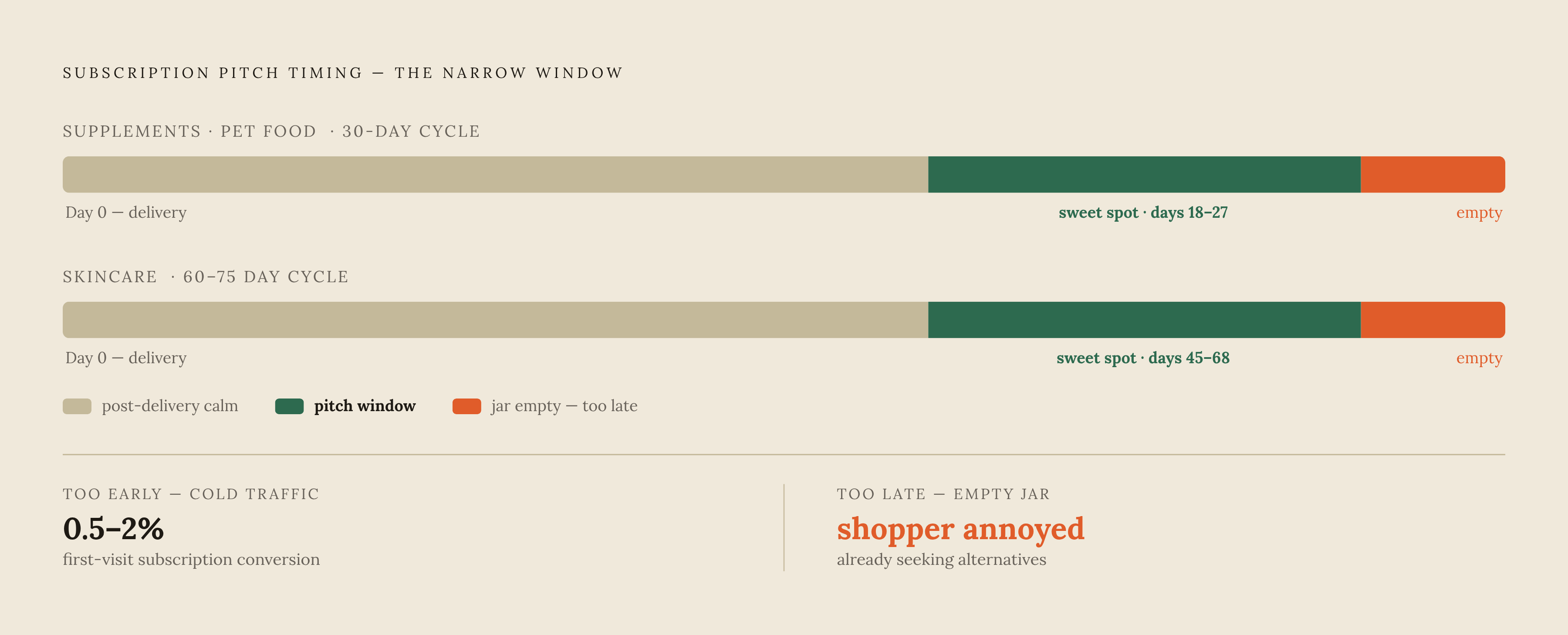
A one-time purchase on cold traffic shouldn't get treated as a failed conversion. When subscription conversion on a first visit runs as low as 0.5 to 2%, a one-time purchase is a qualified lead: someone who liked the product enough to buy it, without yet trusting the brand enough to commit to recurring billing. The subscription gets earned after that first delivery, not during the first toggle interaction, and brands that chase the subscription too early on cold traffic are optimizing for the wrong moment. That instinct, pushing the subscription harder at the point of lowest trust, is exactly backwards.
Getting the follow-up timing wrong causes brands to miss the highest-intent moment for a subscription pitch, cutting conversion at the point when shoppers are most ready to say yes. The window between first delivery and the natural reorder point, roughly 30 days for supplements and pet food, 60 to 75 days for skincare, is that highest-intent moment. The email needs to land before the product runs out, not after. A shopper staring at an empty jar is annoyed. A shopper who gets offered a subscription a week before the jar empties feels like the brand is paying attention.
Referral programs fit naturally into that same window. Customers who refer friends tend to stay subscribed longer themselves, so folding a referral offer into the post-purchase sequence does two jobs at once: it extends lifetime value through retention, and it brings in new customers who arrive already primed with someone else's endorsement.
How AI shopping agents read subscription vs. one-time pricing
By 2026, half of consumers report using an AI agent or AI-powered assistant somewhere in their purchase journey. That's a meaningful shift for toggle design, because an AI agent doesn't click a UI element the way a human does. It reads structured data, and nothing else. A beautifully designed toggle can be functionally invisible to half the audience evaluating it.
When an agent evaluates a product, it translates a shopper's request into parameters, category, price range, required features, then queries product feeds, APIs, and web pages to find a match. A subscription price that only exists as a toggle state, invisible until a human clicks it, stays invisible to that agent too. If the subscription price and terms aren't exposed in the underlying data feed, the agent can't see them, no matter how well the toggle is designed for a human shopper standing in front of the screen.
Two protocols now exist specifically to standardize this. The Agentic Commerce Protocol, co-developed by OpenAI, Stripe, and Meta and released September 29, 2025, governs how AI agents complete checkout inside conversational interfaces like ChatGPT. Google's Universal Commerce Protocol, launched at NRF 2026, covers a wider span of the journey, from discovery through post-purchase. Both point toward the same requirement: subscription pricing, savings, and billing terms need to live in structured, machine-readable data, not just in the visual toggle a human sees on the page. Brands that only solve the toggle for human eyes are optimizing for a shrinking half of their traffic, and machines reading their pages won't wait around for the redesign meeting to happen.