
Social Proof Placement on Shopify Product Pages
Placing social proof at the moment doubt actually strikes lifts conversions dramatically.
Social proof placement fails on Shopify because brands install a review app, drop the widget at the bottom of the page, and call it done. That's the wrong diagnosis. Every product page is a sequence of small decisions, each carrying its own doubt, and a piece of proof only works when it appears at the exact moment that doubt occurs. Put the right evidence in the wrong spot and the doubt just sits there unanswered, and the shopper leaves. Spiegel Research Center found that displaying reviews can lift conversion by as much as 270%, but that number assumes the review is visible when the decision is actually forming, not buried three scrolls down. Against a backdrop where the average Shopify store converts at just 1.4% (per blendcommerce.com's 2026 benchmarks), a placement mistake costs real revenue. It's the difference between a viable store and one that's quietly bleeding out. This piece covers the product detail page only: homepage, collection pages, and checkout each run on different placement logic and deserve their own treatment.
How decision zones shape PDP placement
Split any product detail page in half and you get two distinct behavioral zones, and they ask two different questions. Above the fold, the shopper is still deciding if this is the right product. Proof here has to work fast: a glance, not a read. Below the fold, the shopper has already scrolled, which means they're interested, but interested isn't the same as convinced. They've got a specific objection now, whether it's about fit, quality, shipping, or whether the thing is even real, and the proof that answers those objections can afford to be longer and more granular.
Cartylabs.com's review of high-converting Shopify PDPs lays out what belongs in the top zone without a scroll: title, image, price, variant picker, the call-to-action button, and star rating with review count. Title, image, price, variant picker, the call-to-action button, and star rating with review count are the core elements that belong in the top zone. Nothing else earns space there. Mobile makes this stricter, not looser: Shopify traffic runs over 70% mobile, which shrinks the visible zone to a sliver of what a desktop shopper sees, and any placement mistake gets magnified accordingly.
Easyappsecom.com recommends limiting proof elements to three or four per page. Not every proof type deserves a spot on every page. The job is choosing which three or four elements a given page needs and where they go, which means star ratings, review counts, UGC photo reviews, bestseller and trending badges, real-time purchase notifications, trust badges, and expert or media mentions all need a specific home rather than a shared pile at the bottom of the page. The rest of this piece maps each one to its zone.
Star rating and review count: placement directly below the product title
This is the single highest-leverage placement on the entire page. "★★★★★ 4.8 (1,247 reviews)" "★★★★★ 4.8 (1,247 reviews)" Cartylabs.com places it directly under the product title, before the price even loads into view. The logic is simple: once a shopper has decided this might be the right product, their very next question is whether other people trust it. Answer that before price anxiety even has a chance to set in, and you've cleared an objection the shopper hadn't consciously articulated yet.
Make the rating clickable. Anchor it to scroll down into the full review section, so shoppers who want depth can get it without hunting for a tab. And avoid the mistake cartylabs.com flags repeatedly: parking the star rating exclusively inside a review widget at the bottom of the page. Hiding reviews behind a tab cuts their visibility by 60 to 80%, which means most of the trust signal a brand paid a review app to collect never gets seen.
Okendo backs this up from a different angle: displaying star ratings near the product title, and keeping how reviews render consistent across every PDP, gives shoppers fast access to the proof they need to decide. Brands running Okendo Reviews have seen conversion rates improve up to 4x. That is not a marginal optimization. That's a rating widget doing the job it was installed to do, instead of sitting unused at the bottom of a page nobody scrolls to.
Review count carries its own weight alongside the star average. A 4.8 built on 12 reviews reads as thin, maybe even suspicious. A 4.8 built on 1,200 reads as settled fact. Both numbers need to be visible together, not just the stars alone. And for newer products still building a review base: don't suppress the widget just because the count is low. Even a small sample with a strong average beats showing nothing at all, and the gap narrows fast once post-purchase email sequences start doing their job.
Trust badges: the narrow window above the Add to Cart button
The doubt trust badges are built to answer is blunt: will the shopper's card be safe, can the item actually be returned, will it show up. That fear peaks at one exact moment, the second before a finger taps Add to Cart, which means that's where the badge has to live. Cartylabs.com states that trust badges belong above the buy button or directly adjacent to it. That's the highest-leverage spot on the page for this signal. Footer placement isn't useless, but it's a fraction as effective, since by the time a shopper reaches the footer the purchase decision is usually already made one way or the other.
That zone includes free shipping threshold, a plain-language returns policy, secure checkout icons (Shop Pay, the card network logos, Apple Pay), and, where relevant to the category, a material certification or a "Made in [country]" mark. Easyappsecom.com's mobile rule matters here too: if a shopper has to scroll past the CTA to find the returns badge, the badge has already failed at its one job.
Keep this zone tight. Three or four badges, maximum. Stack five certification logos, six payment icons, and a security seal into a wall of graphics, and the effect flips from reassuring to alarming. It starts to look like a page that's compensating for something. Stock urgency messaging ("Only 3 left") belongs in this same trust category, but cartylabs.com is unambiguous on the rule: use it only when it's true. Fake urgency is named as the single biggest trust killer on a Shopify PDP, which makes it one of the few placement mistakes that actively costs a brand credibility rather than just failing to help.
Trust badges and social proof badges (bestseller, top-rated) often use the same visual language, a small icon plus a short label, but they're answering different questions and belong in different zones. Conflating the two is an easy design mistake with a real conversion cost.
Bestseller and trending badges: collection page first, PDP second
"Is this a good choice among many options" is a question a shopper asks while comparing, not after they've already committed to a product page. The loudest place for a bestseller or trending badge is the collection page and site navigation. Shopify's 2026 guidance recommends building dedicated "Best Sellers" or "Top Rated" collections and surfacing them in navigation, so the badge does its pre-qualifying work before the click, not after.
The badge still earns a spot on the product page, just a quieter one. It still earns a spot, just a quieter one: near the title or the image, reinforcing a decision the shopper has effectively already made, rather than trying to relitigate the choice from scratch.
Real-time purchase notifications, the "12 people bought this today" pop-ins, run on the same crowd-proof logic and carry real numbers behind them. Provesrc.com's data puts the average conversion lift at 10 to 15%, with high-intent product pages seeing spikes up to 32%. But placement changes the outcome substantially. Craftshift.com's research found that a notification printed directly on or beside the product image converts meaningfully better than the same message delivered as a corner popup that slides in after a delay, simply because the image is where every shopper's eyes already are. A popup competing for attention in the corner is fighting for a glance it may never get.
There's a ceiling here, though. Easyappsecom.com warns against stacking too many of these signals: a star rating, a reviews badge, and a trust badge cluster already crowd the page, and a purchase notification popup on top of all that risks reading as noise instead of confidence. Craftshift.com points to an emerging pattern of self-optimizing proof, systems that track which signal actually lifts conversion for a given product and serve that one dynamically. Sold count for a bestseller, star rating for a premium item. Static badge placement is the baseline. This is where the practice is heading.
Photo reviews and UGC: the zone where objections about fit, feel, and real-world use get resolved
A shopper who's scrolled past the buy box hasn't lost interest. They've got a specific, unresolved question: does it actually look like the photos, does it fit the way the size chart claims, what does it look like on someone built like them. Text reviews can gesture at answers. Photo reviews settle it. Shoppers consistently turn to reviews to confirm fit, quality, and real-world appearance before buying, and a photo does that confirming work faster than a paragraph ever could.
The gap in performance is not small. Cartylabs.com's review of Shopify PDP practices found photo reviews convert at two to four times the rate of text-only reviews. That's a wide enough margin that collecting photo UGC belongs in the core post-purchase email sequence, not treated as a bonus ask tacked onto a satisfaction survey.
Yotpo.com says specificity is what separates a useful review from a wasted one. "I'm 5'10" and the Large fits perfectly" answers a real question. "Great product, love it" answers nothing. The review that resolves a concrete doubt is the one doing the closing work, and it's worth designing collection prompts that pull for exactly that kind of detail rather than generic sentiment.
Placement within the lower half of the page affects how the review section is sequenced relative to FAQ and related products. The review section should land after the long-form description and spec list, and before FAQ and related products, since the sequence mirrors how a shopper actually thinks: first, what does the brand say, then, what do people who bought it say. On mobile, reviews need to expand, not paginate. Easyappsecom.com is direct about this: nobody wants to hit "page 2 of 47" on a phone. An accordion or a load-more pattern keeps the depth available without making the page feel bottomless. And the same tabbing mistake that hurts star ratings up top hurts here too: cartylabs.com found that burying reviews behind a tab cuts their visible impact by 60 to 80%, regardless of how strong the reviews themselves are.
Expert mentions, media logos, and authority proof: a signal with one right location and several wrong ones
Authority proof, a "Forbes" mention, a dermatologist's quote, a certification body's seal, answers a different question than star ratings do. Ratings tell a shopper the product works. Authority proof tells them the brand is legitimate in the first place, which matters most in categories where safety, efficacy, or credentials carry real weight: skincare, supplements, apparel with material or performance claims.
Yotpo.com and Shopify's guidance agree on this much: authority signals build trust fast, but only when placed with restraint. The right spot is somewhere in the lower half of the above-fold area or near the trust badge zone, close enough to the purchase decision to matter. Close enough to the purchase decision to matter, but not so loud it overshadows the product itself. Equally important is avoiding spots where the signal competes with or overwhelms the product itself. Authority proof is a supporting signal, not a headline, and treating it like one undercuts the product it's meant to elevate.
One well-sourced, specific quote, "Recommended by the American Podiatric Medical Association," carries more weight than a row of five generic media logos stacked in a strip. As with reviews, specificity reads as evidence, and a wall of logos reads as decoration. For Shopify brands without major press coverage to lean on, certifications, material sourcing, sustainability, safety standards, and endorsements from smaller niche-relevant creators do the same job. The mechanism is identical: third-party validation. Only the source changes.
How AI shopping surfaces read product page proof
AI-mediated shopping stopped being a hypothetical sometime around early 2026. Adobe Analytics measured a 393% year-over-year jump in AI-referred traffic to US retail sites in Q1 2026, and that traffic converted roughly 42% better than traffic arriving through other channels. That's a large enough shift that placement strategy has to account for a second kind of visitor: one that never actually scrolls the page.
AI agents, ChatGPT, Google, Perplexity, Gemini, don't experience visual hierarchy. They read structured data: product titles, descriptions, review scores, review counts, attributes, catalog metadata. Paz.ai's breakdown of how these agents evaluate products lists structured data quality, relevance to stated intent, price competitiveness, availability, reviews, and merchant trust signals as the inputs that matter, with catalog completeness, real-time accuracy, and natural-language match to a shopper's query among the factors that matter. Design and visual placement, the entire discipline this article has spent five sections on, simply doesn't register to a system reading a feed.
The practical consequence: a star rating rendered beautifully by a theme widget but absent from the page's schema markup is invisible to an agent parsing the catalog. The rating has to exist in structured data, not just on screen, or it doesn't exist at all as far as an AI shopping surface is concerned. Review content becomes a catalog asset too in this framing. Specific reviews mentioning size, material, or use case give an agent the natural-language signal it needs to match a product to a shopper's actual query, the same way a specific photo review convinces a human browsing the page directly.
There's a real tension: AI's growing role in product discovery clashes with shoppers' distrust of AI at the payment step. Digitalapplied.com's 2026 figures show 63% of shoppers say they want AI involved in product discovery, but only 4% trust an AI agent at the actual payment step. That gap means AI-surfaced recommendations still have to land somewhere: a human-readable PDP that closes the sale with the same proof this article has been mapping zone by zone. The two layers aren't in competition. Structured data brings the shopper to the page; visible, well-placed proof closes the decision once they're there. Brands that enrich catalog attributes, schema, and descriptions as one unified effort serve both audiences with the same underlying content. Brands that treat structured data and on-page design as separate projects tend to end up with gaps in both.
A placement audit checklist for Shopify product pages
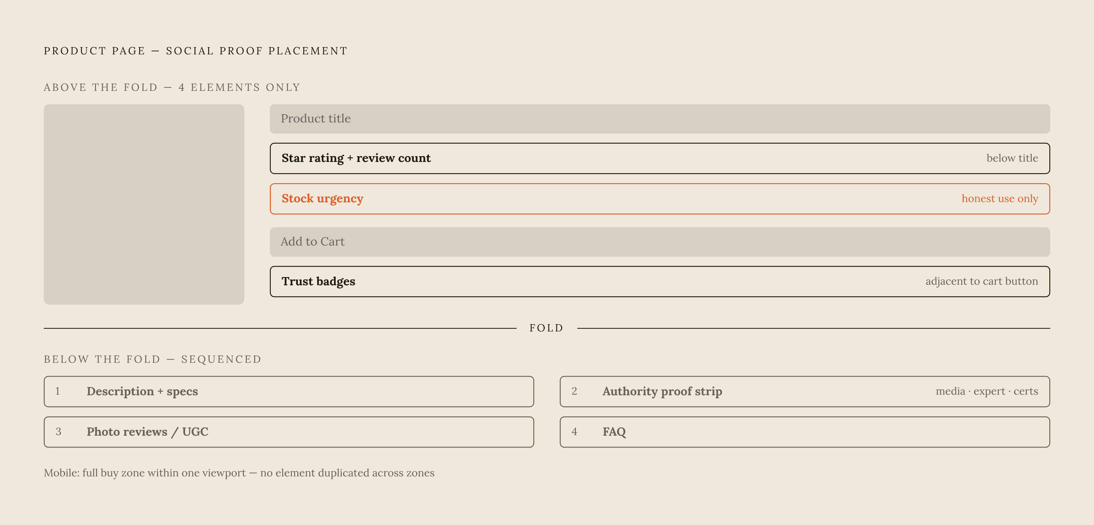
Above the fold, four things belong and nothing else does. Star rating with review count sits directly below the title, before the price, and it's clickable through to the full review section. Trust badges sit adjacent to or just above the Add to Cart button, never in the footer alone. Stock urgency, if it's used at all, is in that same zone and it's honest, specific, and never fabricated. And that's the ceiling: no review widget, no UGC gallery, no media logo strip belongs above the fold. Any of those slows the buy decision down instead of speeding it up.
Below the fold, the sequence matters. Photo reviews come after the description and spec list, before FAQ and related products. Reviews expand or load more on mobile; they're never tabbed away and never paginated. An authority proof strip, media mentions, expert quotes, certifications, sits between the description and the reviews, or gets its own dedicated band. A bestseller or trending badge, if the product has earned one, stays near the title or image rather than getting duplicated further down the page, where a crowd-size signal has already lost most of its punch.
Mobile gets its own pass regardless. The full buy box, title, image, price, variant picker, CTA, star rating, needs to fit in one viewport without a scroll. Trust badges need to be visible without scrolling past the CTA. Purchase notifications can't cover the CTA or the variant picker, ever. And reviews run on an accordion or load-more pattern, never pagination.
None of this is complicated in isolation. What makes it hard is that each piece of proof has exactly one zone where it does its best work, and every other zone is a downgrade, sometimes a severe one. Placement is the strategy, not decoration on top of it. It is the strategy.
Sources
- How To Add Social Proof on Shopify in 2025
- Shopify Product Page Best Practices: 17 PDP Elements for 2026
- Social Proof For Shopify: The Ultimate Guide
- Shopify social proof that converts: put it on the product image (2026)
- Social Proof Widget for Shopify: 5 Proven Ways to Turn Hesitant Shoppers into Buyers - easenotify.com
- Shopify Social Proof Guide 2026 | Boost Conversions with Trust Signals
- digitalapplied.com
- Product Page: 15 Examples + Best Practices (2026) - Shopify