Product Page Hierarchy for High-AOV DTC Items
Structuring product pages to resolve shopper doubts in the order they actually arise.
The DTC market hit $239.75 billion in 2025, but a unit-economics problem causes the growth headline to obscure it. Customer acquisition costs have climbed 222% over eight years, now landing between $68 and $84 per new customer, which means brands lose roughly $29 on the average first purchase before that customer ever comes back. For a product page selling something above $200, that math leaves no room for a confused shopper who bounces halfway through. Every session on a high-AOV page is a high-stakes event, and the standard conversion benchmarks used to judge these pages are comparing apples to a different fruit entirely: stores under $60 AOV convert at a median 2.42%, while stores above $200 convert at 0.79%. Those are different shopper populations with different psychology, not a performance gap to close, and a 1% conversion rate on a $200-plus item may already represent strong execution.
The real problem on most high-AOV pages isn't a lack of content. If anything, these pages tend to carry more specs, more copy, and more images than their low-AOV counterparts. What they get wrong is sequence: they answer questions the shopper hasn't asked yet, in an order that doesn't match how anxiety actually builds during an expensive purchase.
How expensive purchases produce a distinct pattern of shopper anxiety
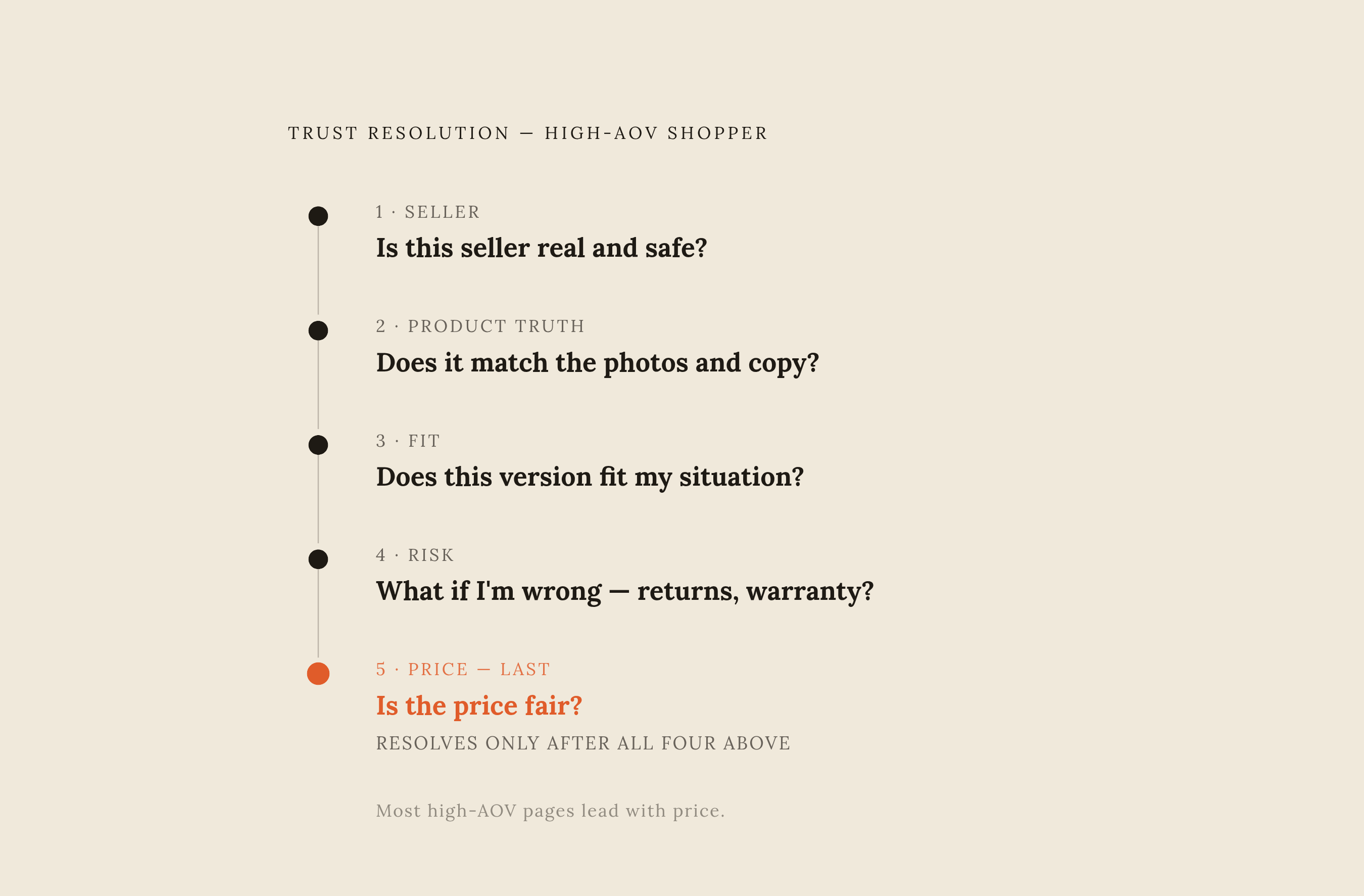
High-AOV hesitation isn't a single emotion sitting on top of the page. It's a layered progression, and each layer has to resolve before the next one even becomes visible to the shopper.
The first question, arriving within seconds, is whether the seller is real and safe. Only after that gets settled does the shopper start interrogating the product itself: is this actually what the photos and copy suggest, or is something being hidden? Once the shopper trusts the product matches the photos and copy, attention shifts to fit, whether this exact version works for this exact situation, down to dimensions, compatibility, and use case. Then comes the question of consequence: what happens if the choice turns out wrong, which pulls in return policy, warranty, and how responsive customer service actually is. Price fairness, oddly, tends to appear last at high AOV, not first, contrary to how most pages are built around leading with the number.
That personalization expectation isn't optional anymore either. The overwhelming majority of consumers now expect relevance to their specific situation as a baseline, not a bonus feature. A page that stacks specifications before it's resolved basic trust, or buries the return window in a footer link, is answering a question three stages ahead of where the shopper actually stands.
The first screen: trust signals that must appear before a high-AOV shopper reads anything else
Above the fold has one job: kill the identity-and-trust question completely before anything else competes for attention. Any lingering doubt about legitimacy at this stage ends the session, no matter how good the product content further down turns out to be.
That means a few things need to be visible without scrolling. A clean brand presentation, free of the visual noise that reads as generic drop-shipping. An aggregate rating paired with an actual review count, since the count is what signals real customers rather than a plugin. One plain-language guarantee statement, whether that's a return window or a money-back promise, stated where it can be seen, not buried in fine print three clicks away. If checkout happens on the same page, a visible secure-checkout indicator earns its place here too.
What doesn't belong at the top is a detailed spec sheet or a comparison table. Those answer fit questions the shopper hasn't reached yet, and stacking them before trust is resolved just adds noise. The hero image carries more weight than a typical lifestyle shot: at high AOV, it needs to show material texture, scale, and true color, because the product-truth anxiety is already forming while the shopper studies that first frame. Price can and should appear early for context, but showing it alone, with no anchor, risks losing the shopper before trust has had a chance to take hold. Pairing it with a cost-per-use figure or a comparison to an alternative spend gives the number somewhere to land.
Product truth: the visual and descriptive evidence that resolves fear of the unknown
Every high-AOV session raises the same question, which drives what happens next: what will this person discover only after the box is opened? The page's job is to answer that before it's asked, not after the return request comes in.
That starts with the image gallery. Multiple angles, including the underside, the interior, and any hardware or mechanism most buyers wouldn't think to ask about. At least one image with a scale reference, whether that's the product next to a familiar object or worn on a body. Close-up shots of texture and material, since for anything where touch matters, a photo is the only proxy a shopper has. And where color shifts under different lighting, an honest showing of that range rather than a single flattering shot.
Video earns its place here too, but not as a brand film. A short demonstration showing how the thing opens, assembles, wears, or operates does more to resolve product-truth anxiety than any amount of aspirational footage. Copy at this stage should name the actual material and construction method, and it should state any known limitation directly. An acknowledged limitation, stated honestly, builds more trust than an omission ever will. What this content is not: feature bullets that describe a benefit without grounding it in something physical, or "premium quality" language that never says what makes it premium.
Once the shopper trusts the product matches the photos and copy, the shopper's doubt moves. The doubt shifts from the item in general to whether this version fits their situation specifically.
Fit resolution: structured content that answers the shopper's specific situation without requiring them to ask
This is where most high-AOV sessions actually stall. The shopper wants the product. What they're not sure of is whether it's right for them, and that uncertainty is quieter than outright rejection, which makes it easy to miss in analytics.
Static content can handle a lot of this. Size guides that ask for body measurements rather than pointing at a generic chart. Compatibility tables for anything tech-adjacent. Use-case headers, "for small apartments," "for daily commuting," that let a shopper self-sort into the section that actually applies to them. And counterintuitively, an explicit "this isn't right for X" statement tends to build more trust than it costs in lost sales, because it signals the brand isn't just trying to move units.
Static pages hit a ceiling fast, though. Fit questions are individual by nature, and no chart can anticipate every combination of room dimensions, skin type, riding style, or frequency of use. This is where an on-site AI trained on the brand's catalog, policies, and product details lets a shopper asking "will this work in a 10-by-12 room with low ceilings?" gets an answer in natural language instead of stalling out and leaving. The same structured fit data, dimensions, compatibility, use-case tags, also determines whether an AI shopping agent reading the page from outside can even parse the product; agents evaluate based on attribute completeness, not page design, so a listing without that structure is functionally invisible to them regardless of how it looks to a human. Brands using AI-driven personalization report 40% more revenue than those that don't, and this fit layer is where that gap tends to open.
Deep proof: the review architecture and third-party validation that makes the price defensible
A star rating by itself doesn't do much at high AOV. The shopper needs to verify that the people leaving those reviews actually share their situation, not just that enough of them clicked five stars.
Filtering by use case or verified purchase status helps. So does surfacing reviews that specifically mention durability or say something like "after eight months of daily use," since those speak directly to value anxiety rather than general satisfaction. Reviewer context, "bought for apartment living," "uses this for a daily commute," lets a Stage 3 shopper recognize themselves in someone else's experience. And a rating that includes visible critical reviews and a thoughtful brand response can read as more credible than a suspiciously spotless perfect score, which many shoppers have learned to approach with skepticism.
Third-party validation adds another layer: press mentions, awards, or certifications tied specifically to the product rather than to the brand's reputation in general. This matters for more than human shoppers now. The same signals that resolve a human's value anxiety, authoritative list mentions, award citations, and review volume, are increasingly what gets a product surfaced by AI shopping tools. Different AI systems process these external signals in different ways, but third-party validation and review depth factor into how products get recommended. Building review depth isn't a future-proofing exercise anymore; it's already serving both audiences at once. Framing value through cost-per-use over the product's expected lifespan, or through comparison to a pricier ongoing alternative, tends to land better at high AOV than a straightforward discount claim ever does.
Commitment architecture: return policy, warranty, and checkout friction as the final conversion layer
The "what if I'm wrong" question doesn't peak while browsing. It peaks in the second right before the click, which means the return policy needs to live near the add-to-cart button, not in a footer link or a separate policy page three navigations away.
State the return window in clear terms. Say whether it's free. Say what condition the item needs to be in. Extended trial periods change how risk feels at high AOV: the shopper can commit knowing they'll have real time to test fit in actual use, not just inspect it out of the box. A warranty, treated as a feature rather than a buried legal disclosure, sends a signal too: the brand is staking a claim on its own durability, and stating the duration outright does more work than hiding it in a terms page.
Checkout friction hits high-AOV purchases harder than cheap ones. Forcing account creation before purchase costs more here than it does on a low-priced item, so guest checkout needs equal footing. Financing or installment framing can shift a shopper's mental math from "a large one-time outlay" to "a manageable monthly cost," which matters more the higher the price climbs. Accelerated checkout options cut down the moment of hesitation that comes from manually keying in payment details. And a visible live chat or AI assistant at this exact stage, for shoppers with one last unresolved question, tends to be the difference between a sale and an abandoned cart: an unresolved last question is a meaningful abandonment risk at this stage.
Deliberately absent from this stage: upsells and cross-sells. Introducing more decisions at the exact moment someone is trying to make one adds friction that high-AOV purchases are particularly ill-suited to absorb. That layer belongs after add-to-cart, or on the confirmation page, not before.
How AI agents read a high-AOV product page and what structured data makes them recommend it
AI agents don't see a page the way a person does. They parse structured data: schema markup, feed attributes, review signals. A page that looks beautifully designed to a human eye but carries unstructured, incomplete data is effectively invisible to a shopping agent, no matter how polished the layout.
This isn't a niche concern anymore. AI-driven traffic to retail sites surged 805% year over year during Black Friday 2025, according to Adobe Analytics, and Salesforce reported AI touching roughly one in five orders during Cyber Week of that year. Different agents weigh different signals. Some pull from shopping feeds and lean on authoritative list mentions, award citations, and review volume. Others crawl the live web and prioritize third-party citations from forums and expert blogs over the brand's own copy. Some evaluate intent signals in product highlights alongside local inventory data, and ecosystem-specific assistants synthesize review sentiment and Q&A content directly.
The common thread is catalog completeness. Products carrying full structured attributes, dimensions, materials, compatibility, use-case tags, availability, shipping speed, get recommended more often, and incomplete data means the agent simply moves on to a competitor whose listing it can actually parse. That gap is already visible in the numbers: a majority of brands that rank well on traditional search are not being cited by AI systems at all, which means SEO investment doesn't automatically carry over into this new surface. Practically, that means product schema needs the full attribute set, not just title and price. Review schema needs the aggregate rating and count exposed, not hidden in a third-party widget an agent can't read. Inventory and pricing in the feed need to stay current. And description copy should match how people actually phrase their needs, "waterproof hiking boot for wide feet under $200," because the same specificity that helps a human self-identify fit is what helps an agent match intent. The efficient path is one accurate, structured data source feeding both the human-facing page and the machine-facing feed, rather than maintaining two separate content tracks that inevitably drift apart.
The measurement reality: what a high-AOV page hierarchy actually moves and how to know
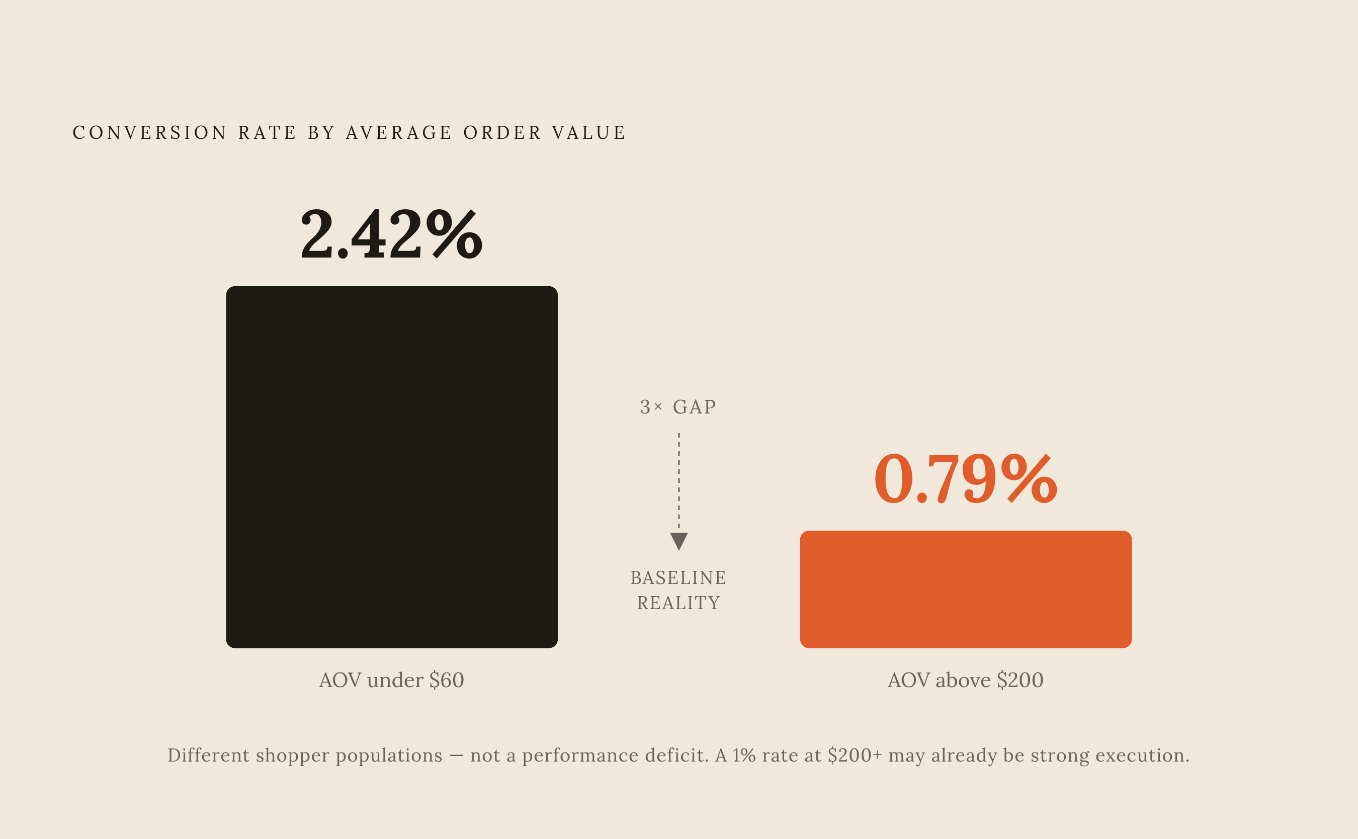
Conversion rates above $200 AOV are a median of 0.79%, which means small absolute improvements represent real revenue, but it also means measurement has to be precise enough to catch a signal that small in the first place.
Each layer of the hierarchy has its own signal to track. At the trust layer, scroll depth past the hero and first-session bounce rate tell you whether the opening trust signals are landing at all. At the product-truth layer, image gallery engagement and video completion rate show whether Stage 2 anxiety is actually being resolved or just skimmed past. At the fit layer, longer session length and chat or Q&A initiation aren't red flags, they're consideration, and treating that engagement as confusion is a common misread. At the proof layer, review filter usage and time spent in the review section signal genuine due diligence rather than stalling. At the commitment layer, the numbers that matter are add-to-cart rate, checkout abandonment, and how often shoppers actually take the financing option when it's offered.
One caution on attribution: platform-reported return on ad spend tends to overstate the real number by a wide margin under current tracking conditions, which means a hierarchy change that genuinely improves conversion will often look smaller in a dashboard than it actually performed. Measuring against a brand's own baseline, rather than trusting platform-reported figures at face value, is the only way to see the real effect. And for brands not yet appearing in AI-generated shopping recommendations at all, that's a measurement gap that deserves the same scrutiny as any conversion metric on the page itself.
Sources
- Agentic Commerce: AI Shopping Agents Guide 2025
- Agentic Commerce in 2026: How AI Agents Buy Products | Paz.ai
- High Consideration Products: Build Trust in 2026 - Shopify
- Expensive Products Need Many Touchpoints | Oeave
- Ecommerce Conversion Rate Benchmarks 2026: Real Data from 21 Shopify Stores
- The Anatomy of a High-Converting Product Page for Health and Wellness DTC Brands
- shopify.com
- buildgrowscale.com