Quiz and Configurator Flows as Pre-Cart Conversion Tools
Guided product matching replaces browsing uncertainty with confidence before checkout.
Cold traffic doesn't convert like it used to, and the reason isn't a mystery: acquisition channels are pulling in more browsers and fewer buyers, and the gap between the two is getting wider every quarter. Quiz and configurator flows exist to close that gap. They work by replacing passive scrolling with a guided decision, matching a shopper to a product before the shopper ever has to decide for themselves whether they've found the right one.
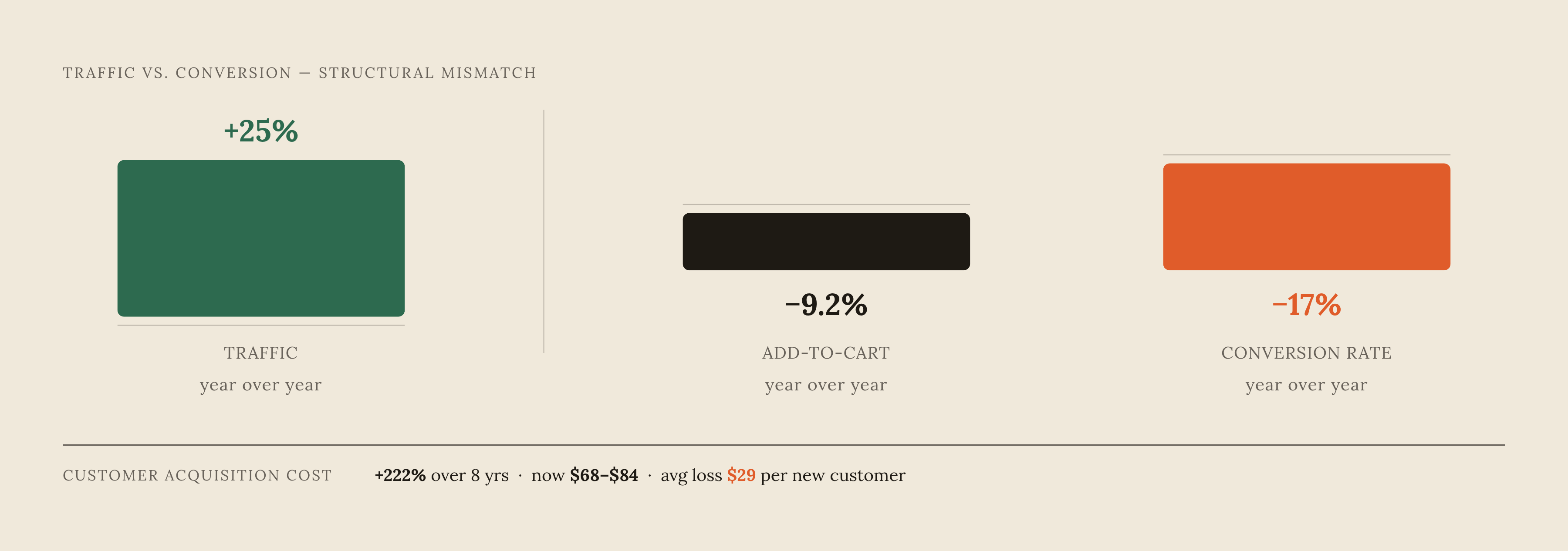
Across 21 Shopify stores generating a substantial combined revenue, dtcpages.com's 2026 benchmark report put median conversion rate at 2.07% and mean at 2.16% for Q2 2026, and the numbers behind this shift are stark. Across 21 Shopify stores generating a substantial combined revenue, dtcpages.com's 2026 benchmark report put median conversion rate at 2.07% and mean at 2.16% for Q2 2026. Add-to-cart rates fell 9.2% year-over-year even as traffic grew 25%, and conversion rate itself declined 17% over the same stretch, a structural drift that points to one conclusion: incoming traffic is colder, and more visitors are browsing without any real intention to buy. Add-to-cart rates fell 9.2% year-over-year even as traffic grew 25%, and conversion rate itself declined 17% over the same stretch, a structural drift rather than noise. That's a structural drift, and it points to one conclusion: incoming traffic is colder, and more visitors are browsing without any real intention to buy.
Acquisition cost has climbed 222% over eight years, with average ecommerce CAC running $68 to $84 in 2025, which makes the math uglier still. Customer acquisition cost has climbed 222% over eight years, with average ecommerce CAC running $68 to $84 in 2025. Brands are spending more to bring in visitors who are less likely to convert once they arrive, and the result is a loss, not a breakeven. Average loss per new customer acquired is around $29. Passive browsing, in other words, has become an expensive habit to indulge.
None of this gets solved by buying more traffic. It gets solved by building a mechanism that converts the traffic already arriving, before that visitor bounces. That's the case for quiz and configurator flows: not as a novelty feature, but as infrastructure for a colder-traffic, higher-CAC environment.
What quiz and configurator flows do structurally
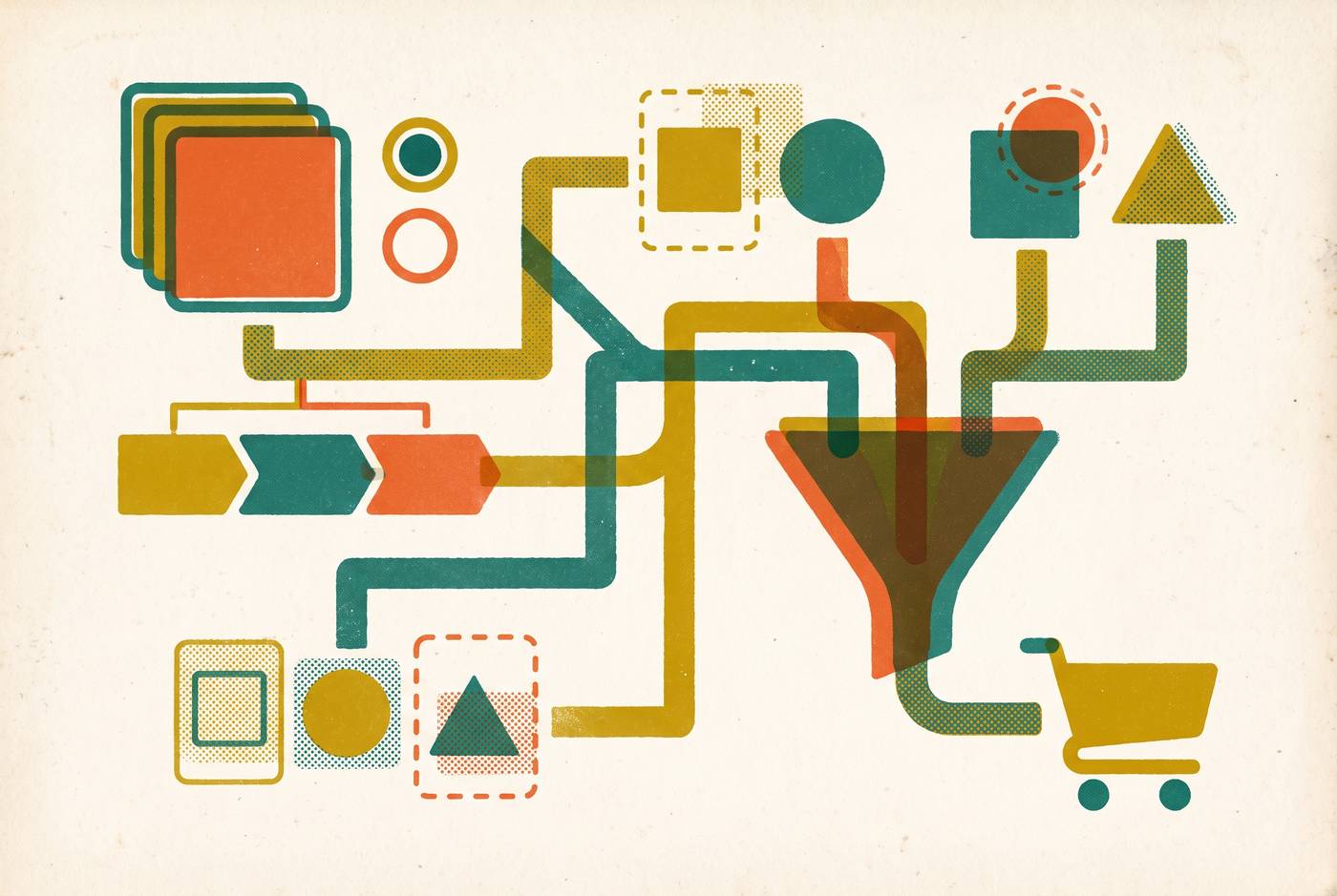
A quiz funnel is a five-stage path. RevenueHunt's breakdown of the format describes it as a five-stage path: Attention, Interest (the quiz itself), Desire (the results page), Action (checkout), and Retention (the email flows that follow). The structure matters because it reframes what the shopper is doing. On a standard product page, the visitor is dropped in front of a catalog and left to sort it out alone. A quiz asks what the visitor needs, hands back a specific match, and removes the "was this actually the right one?" hesitation before the visitor gets anywhere near the cart.
That hesitation is expensive. Baymard Institute's research across 49 to 50 ecommerce studies puts cart abandonment at roughly 70%, and a meaningful share of that is uncertainty rather than price resistance. It's uncertainty, plain and simple: shoppers add something to the cart, then can't quite convince themselves it's the right choice, then leave.
The four-stage build breaks down like this. Stage one is the quiz itself: four to six questions, usually under 90 seconds, one question per screen so the shopper feels like they're being asked rather than sold to. Stage two is the email capture, gated behind the results. This is the moment that does the heavy lifting on lead generation. Industry analysis of quiz lead data has found that a gated quiz result converts at a substantially higher rate than a standard popup. Stage three is the recommendation: answers get scored or tagged, and the results page surfaces a matched product with a direct path to add-to-cart, no detour through the catalog. Stage four pushes those answers into Klaviyo or another email platform as profile properties, so the flows that follow speak to the shopper's actual stated preferences instead of a generic welcome sequence.
Quiz and configurator are related but not identical. A quiz is diagnostic: question, answer, match. It earns its keep in categories where the shopper genuinely doesn't know which product fits, skincare, supplements, foundation shades, lingerie sizing. A configurator is a build-your-own format, suited to categories where the shopper already knows roughly what they want but has to specify the details, custom apparel, furniture, formulated products. Function of Beauty is the clearest example of the two blending into one thing: a multi-step quiz that produces a custom-formula bottle. In that case the quiz isn't a marketing layer bolted onto the product. The quiz is the product, as RevenueHunt's funnel analysis points out.
Different formats, same underlying mechanism. Both convert vague browsing into a declared decision before the shopper ever reaches checkout, and that declared decision strips out the cognitive load that causes cart abandonment.
Where these flows fit in the funnel
Good placement helps a quiz convert; poor placement just adds friction. At the top of the funnel, quizzes work well as an entry point for cold paid traffic, especially from Meta and TikTok, where an undecided visitor needs a reason to engage before they're anywhere near ready to buy. A quiz gives them that reason without asking for a purchase decision up front.
Mid-funnel, quizzes work as disambiguation tools on category or collection pages, particularly for large or complex catalogs where choice overload is what's actually causing the drop-off. And on product pages themselves, a quiz overlay earns its place in high-consideration categories: shapewear, supplements, layered skincare routines, specialty coffee. Anywhere the shopper's real hesitation is "is this the right one for me," a quiz answers that question directly instead of leaving the shopper to guess.
There are categories where a quiz doesn't belong. Low-consideration, impulse products don't need one; the shopper already knows what they want, and a quiz just slows them down. Catalogs with a handful of SKUs don't need one either. If the quiz routes every respondent to the same two products regardless of their answers, that's not guidance, that's theater, and shoppers notice. And a quiz dropped into a purchase flow after the shopper has already decided doesn't convert anyone, it just intercepts a buyer who was already moving toward checkout.
Distribution deserves as much attention as placement. A quiz can run as a popup, an inline embed, a sticky bar, or a standalone landing page, and RevenueHunt's guide shows that running the same quiz inside a Klaviyo email in addition to the storefront can meaningfully increase response volume without doubling the build effort. The dtcpages.com benchmark data offers a useful signal here too: at the $100 to $200 AOV bracket, add-to-cart rates drop sharply compared to sub-$60 products. That's exactly the consideration gap where a guided flow has the most room to work. Match the flow to the shopper's actual state of mind at that point in the funnel, not to a preference for the tool itself.
The performance case: what the data shows
Octane AI reports quiz conversion rates in the 7% to 25% range, against a 2% to 4% average ecommerce conversion rate. 7% and 25% describe very different businesses, very different categories, very different execution quality. Anyone citing "quizzes convert better" without acknowledging that spread is skipping the fact that 7% and 25% describe fundamentally different levels of execution quality.
Documented brand results back up the upside case, though they should be read as evidence of what's possible, not as a guaranteed floor. Spanx's AI Stylist produced a conversion rate increase of over 100%, a substantial sum in annualized incremental revenue, and a 38x return on spend. CrazyBulk, running on Digioh, saw a 141% conversion rate increase and 16x ROI. Andie Swim, also on Digioh, reported a 296% lift in conversions and 96x ROI. Bedgear's shoppers became several times more likely to buy, with overall conversion rates up 490%. RevenueHunt cites an unnamed customer generating a 42.64% AOV increase and $691,000 in 90 days, running on cold Meta traffic.
Read those numbers with the right amount of skepticism. Case studies published by quiz platform vendors describe their best customers, not their median ones. A 490% lift belongs to Bedgear's specific implementation, in Bedgear's specific category, with Bedgear's specific quiz design. It isn't a promise that transfers to any brand that installs the same tool. What does transfer is the floor: a well-designed quiz, deployed in a category where the shopper genuinely needs guidance, produces a meaningful lift. The ceiling cases show technique to study, not benchmarks to plan a budget around.
Question design and completion rates: the structural decisions that determine outcomes
Length is the first lever, and it's a genuine trade-off, not a solved problem. Most categories fall into a sweet spot of a handful of questions. Fewer than three rarely generates enough structured signal to differentiate one recommendation from another, but completion rates drop 15% to 20% for every question added past five. That tension, more data against fewer finishers, sits at the center of every quiz design decision.
Some brands justify going longer. Function of Beauty runs six to eight questions, Stitch Fix runs fifteen, and both get away with it because the perceived value of the output is high enough that shoppers are willing to spend the time. The rule of thumb: length is only defensible when the shopper genuinely believes the result requires that much input from them.
Framing changes the quality of the answers shoppers give, and this is easy to underestimate. A quiz titled "find your match" reads as a marketing gimmick, and shoppers respond with shallow, low-effort answers. A quiz framed as a "skin assessment" or a "sleep audit" or a "fitness consultation" reads as expertise being offered, and shoppers respond by volunteering real detail. A quiz framed as a "skin assessment" or a "sleep audit" or a "fitness consultation" is a lever on data quality as much as on conversion. It's a lever on data quality as much as on conversion.
Question format matters too. Closed-option, multiple-choice questions move faster and produce clean data that's easy to route into a scoring model. Open-ended questions capture richer, more qualitative signal, but they're harder to translate into a recommendation engine without a human reviewing responses. Most brands are better served leaning closed, reserving one open-ended question at most for texture.
Where the email gate sits changes capture rates significantly. Placing it toward the end of the quiz, after the shopper has already invested 60 or 90 seconds answering questions, captures far more emails than gating at the start, because the shopper wants to see the payoff they've already worked for. Gate too early and much of that traffic simply leaves before committing.
Scoring logic needs to be specific. Each answer should carry a weight or a tag that maps cleanly to a product or a segment. Vague routing, something like "you like bold flavors, so here are our reds," produces weak recommendations and, over time, trains shoppers to stop trusting the quiz. And since most ecommerce traffic now arrives on mobile, any quiz that forces horizontal scrolling, cramped tap targets, or a multi-column layout on a phone screen is going to bleed completion rate no matter how good the questions are.
Zero-party data: why the quiz's real value outlasts the session
Zero-party data is information a customer chooses to hand over directly, and that distinction affects how precisely a brand can target and serve that customer. Behavioral inference can tell a brand that a shopper browsed a handful of mid-priced moisturizers. A quiz can tell the brand that the shopper has sensitive, dry skin and a defined budget range. One is a guess built from clicks. The other is a stated fact.
The case for zero-party data shouldn't be built on cookie deprecation, because that argument has aged poorly. Google shut down its Privacy Sandbox initiative in October 2025, and third-party cookies remain in Chrome with no end date attached. Brands that pitched zero-party data internally as a hedge against a cookieless future need to reframe the argument around signal quality and durable consent, not around a regulatory shift that never fully arrived.
The real value compounds well past the initial quiz session. Answers land in Klaviyo as profile properties on day one, and from there they inform every segmented campaign, every flow, every retargeting audience for the life of that customer relationship. A Black Friday email sent four months later can still reference the skin type or coffee roast preference a shopper declared on their first visit. Klaviyo's own benchmark data shows highly segmented lists returning more than three times the revenue per recipient compared to unsegmented ones, and a quiz is the fastest route to building that kind of segmentation.
Most brands miss the maintenance side of this, though. A quiz completed once, at first purchase, goes stale if nobody ever refreshes it. Trade Coffee handles this by re-running its taste-profile matching on every reorder, using a single lightweight question, "how was your last bag," to keep the model current without asking the customer to sit through a full re-quiz. That's a small mechanism, but it keeps zero-party data useful rather than letting it age.
A range of brands, ThirdLove, Warby Parker, Jones Road Beauty, Gainful, Sephora, Function of Beauty, and Dr. Squatch among them, run product recommendation quizzes as part of their acquisition and retention strategy, each adapted to its own category. Available client data suggests lifetime value for zero-party-data-acquired customers at several times higher than average. Adding that up, the quiz stops looking like a conversion trick and starts looking like a retention asset with a long tail.
How to design the results page and post-quiz flow for conversion, not just completion
The results page is where most quiz builds quietly leave money on the table. Completion rates are often strong, brands get plenty of people through the questions, but conversion from that final screen is where the real gap appears, because the results page is the least optimized part of the whole flow in practice.
A few things need to be true on that page. The matched product has to sit above the fold with a direct add-to-cart path, no detour into the general catalog, no extra clicks to navigate. A short explanation of why this specific product matches the shopper's own answers reinforces that the recommendation is grounded in something real, not arbitrary. Social proof needs to be specific to the recommended product, reviews and ratings for that item, not a generic testimonial pulled from the brand's homepage. And any upsell or bundle offered on that page should tie back to the quiz answers rather than defaulting to a generic "customers also bought" widget.
The email sequence that follows matters just as much as the page itself. A four-stage structure works well here: day zero sends a confirmation and recaps the recommendation, referencing the shopper's specific answers. Day two brings social proof tied to that matched product. Day four handles objections relevant to the shopper's stated profile, so a shopper who flagged budget sensitivity during the quiz gets a cost-per-use framing instead of a generic pitch. Day seven closes with a soft discount or a light urgency nudge.
Every email in that sequence should reference what the shopper actually said. "Since you mentioned oily skin" beats "welcome to our brand" on open rates, click rates, and conversion, and the reason is straightforward: one email demonstrates that the brand was listening, and the other reads like it was sent to everyone. Brands that collect quiz data and then drop completers into a generic welcome series are throwing away the segmentation they just spent effort earning. The data only pays off if the flow downstream actually uses it.
Peacock Alley, a luxury bedding brand, built its results-page and offer-flow strategy on ConvertFlow and reported a 32% increase in average order value as a result, a concrete example of what a properly built post-quiz sequence can do to order value rather than just completion counts. RevenueHunt's guide shows that running that same quiz inside email campaigns, not just on the storefront, roughly doubles response volume without a second build, a distribution lever that gets overlooked far more often than it should.
Choosing and integrating a quiz or configurator tool without a technical overhaul
Adding a quiz doesn't require ripping out the existing stack. Most quiz and configurator platforms built for Shopify and similar ecommerce systems install as an app or a script embed, sitting on top of the storefront rather than replacing anything underneath it. The integration work that actually matters isn't the install, it's the connection between quiz answers and the email platform, since that link is what turns a one-time quiz result into a lasting segmentation asset.
Before choosing a tool, the category should dictate the format: diagnostic quiz for a shopper who doesn't know what they need, configurator for a shopper who knows what they want but has to specify it. Scoring logic needs to be built out before launch, not patched in after, because vague routing undermines trust in the recommendation from the very first user. And the build should be mobile-first by default, given where most ecommerce traffic actually originates. None of this demands a developer team or a platform migration. It demands a clear question: what decision is the shopper actually struggling to make, and does this flow make that decision for them, or just decorate the page they were already going to leave.