Post-Add-to-Cart Page Design for Upsell Without Abandonment
Upsell after payment clears, not before, to capture momentum without risking the sale.
Baymard Institute puts cart abandonment above seventy percent, and the gap between add-to-cart and order confirmation is where that number gets decided, one design choice at a time. Most stores don't treat this window as its own problem. They treat it as leftover space bolted onto the payment flow, an afterthought wedged between the product page and the receipt.
That's backwards, and it's costly. Every upsell offered before payment clears adds friction to a sale that hasn't happened yet. Every upsell offered after payment clears carries none of that risk, but it also arrives after the money's already in the bank, so it can't influence the original purchase. That's the entire dilemma in one sentence: risk the primary conversion for a bigger cart, or wait until the risk disappears and settle for whatever lift a buyer who's already committed will give you.
Baymard puts the total cost of ecommerce usability failures at roughly $260 billion in lost revenue, and a fair chunk of that comes down to exactly this kind of sequencing mistake. A cart drawer that nudges someone toward free shipping behaves nothing like one that redirects them to a separate page and hands them three fresh chances to bail. Getting the sequence wrong, offering the right thing at the wrong stage, is how an AOV experiment quietly turns into an abandonment spike.
Shopper psychology shifts at each stage from cart to confirmation
The moment right after a buying decision produces something close to momentum, a kind of psychological high that behavioral research on decision-making has long observed. Shoppers are more open to additional offers right after they've said yes to something. Not before.
Robert Cialdini's work on commitment and consistency explains why sequencing matters this much. Once someone commits to buying, a related offer feels consistent with the decision already made, not like a fresh decision demanding scrutiny. Saying yes again costs less, psychologically, because saying no now would contradict the choice just made.
The endowment effect compounds this. Once a shopper mentally owns the item in the cart, they get more willing to buy things that enhance it. A coffee grinder buyer treats grinder-adjacent offers differently after the purchase than before, because after purchase the grinder already feels theirs. That's a large part of why complementary offers made after purchase consistently beat the same offers made before it.
None of this survives contact with checkout, though. Checkout runs on decision fatigue, not momentum. Load the payment screen with choices and drop-off climbs; the breakdown often starts earlier than people assume: many sites fail to give buyers enough information to make sense of cross-sell recommendations at that stage. The lesson holds across the whole funnel: the closer a shopper gets to the pay button, the fewer decisions you should hand them.
Cart drawer design as the first upsell surface
A sidebar cart drawer keeps the shopper on the product page while the upsell appears next to it. A full-page cart redirect pulls them off that page entirely onto a separate URL, and that URL is an exit point that didn't need to exist. The add-to-cart click is the highest-intent moment in the entire session. Sending the shopper somewhere else at exactly that instant breaks the intent state before any upsell gets a real chance to land.
What belongs in the drawer stays narrow on purpose. A free shipping progress bar, updated live as items get added ("add $12 more for free shipping"), is one of the most dependable AOV levers in ecommerce, full stop. Beyond that: one or two complementary add-ons as single-tap additions, plus a "frequently bought together" bundle nudge if the catalog actually supports one.
Proportion matters as much as content here. Upsell material should take up around 15% of the cart layout's visual space, no more than that. Quip's subscription model shows restraint done right: the lower recurring cost sits right in the subtotal area, making the long-term value case without crowding out the add-to-cart button or the shopper's own line items.
Checkout-page upsell blocks: the underused surface where intent and price sensitivity are most favorable
Shopify's Checkout Extensibility framework replaced the older checkout.liquid customization method and lets merchants drop upsell blocks directly into checkout, thank-you, and order status pages without touching checkout code. Migrating old checkout.liquid work still takes real effort, but the barrier that kept most merchants off this surface for years is gone now.
Cartylabs benchmark data shows stores running checkout extensibility blocks see checkout conversion rise around 12% and AOV rise around 18%. The mechanism is straightforward once you say it out loud: intent peaks and price sensitivity bottoms out right at the point of payment entry. Most merchants treat checkout as the most fragile moment in the funnel, the last place you'd want to introduce anything new. That's exactly backwards: most merchants treat checkout as the most fragile moment in the funnel, the last place you'd want to introduce anything new, when it's the opposite. It's the most favorable pricing moment in the whole funnel, not the most dangerous one.
Five block types carry most of the ROI here, and they rank in a fairly consistent order. Smart in-checkout upsells (AI-recommended add-ons priced under 30% of cart value, one-tap "+ ADD," no re-entering payment info) convert best of the five. The free shipping progress bar comes next, carrying the same dynamic-threshold logic from the cart drawer into checkout itself. Shipping protection, an insurance-style add-on usually priced at a few dollars, pulls attach rates between 30% and 50% and drops straight to margin. A free-gift threshold, auto-added once the subtotal crosses a set point, pulls average orders upward toward that line. Cartylabs data shows trust badges and social proof, payment icons, an SSL seal, a star rating under the pay button, lift completion by roughly 2% to 4%.
Don't launch all five on day one. Starting with the smart upsell and the shipping bar allows the effect on conversion to be observed, and the rest can be layered in only once that baseline holds.
The post-purchase page: why zero-friction architecture produces the highest conversion rates on the funnel
The post-purchase page is in the gap between "Pay" and "Thank you." The card's already on file, payment's already cleared, and accepting an offer here takes one tap. No re-entry of payment details, no second checkout flow, nothing standing between the shopper and yes.
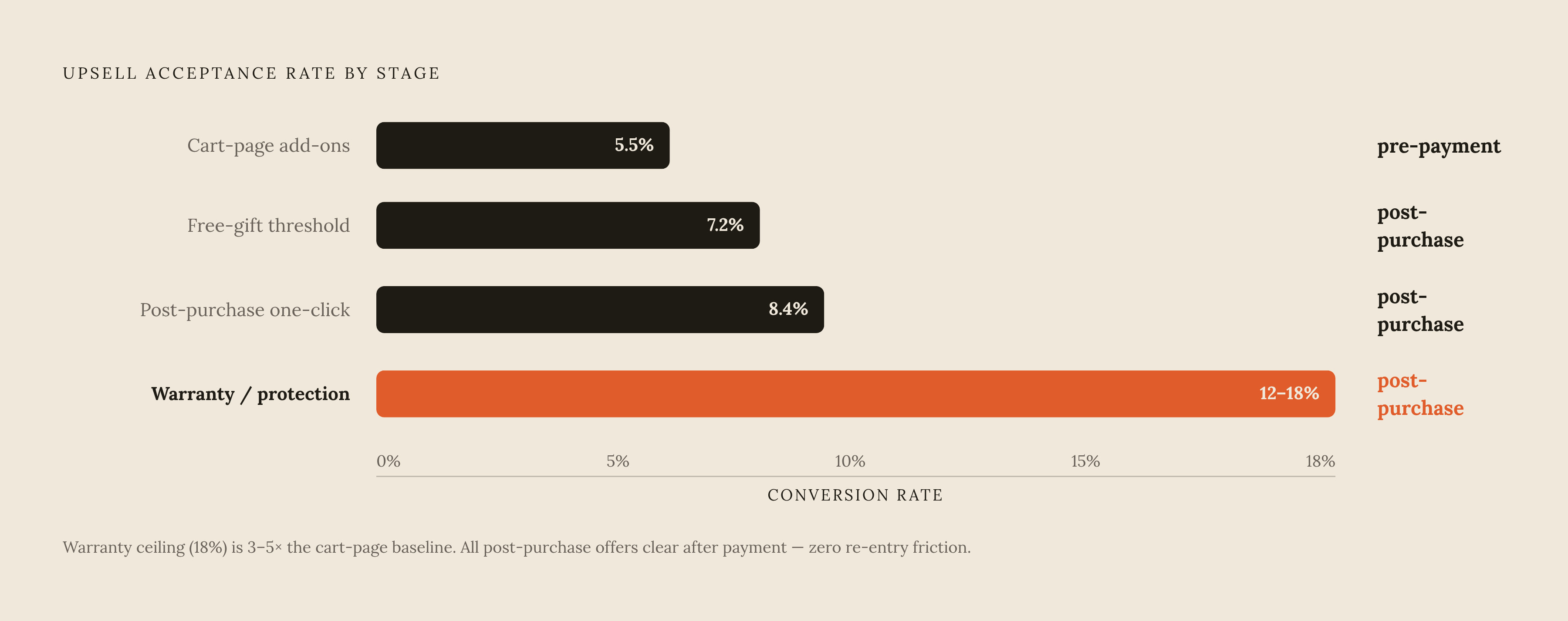
That architecture is the whole reason this page beats everything that comes before it. Cartylabs benchmark data puts well-built post-purchase offers at 8% to 15% conversion, five to ten times higher than anything offered before payment. Acceptance breaks down by offer type: post-purchase one-click offers are around 8.4%, free-gift thresholds around 7.2%, cart-page add-ons around 5.5%, and warranty or protection upsells run notably higher, in the 12% to 18% range.
The design rules that data supports are specific. Show a single product, never a grid, since decision fatigue is what kills conversion at this stage. Make the discount exclusive to the page, with a countdown attached, something like "20% off, only here," creating real urgency without tipping into manufactured scarcity. Keep the offer complementary: a coffee grinder buyer gets beans. Price it under roughly half the original order value, because anything bigger starts to read as a second purchase decision and drags the friction right back into a flow built to erase it. On mobile, keep it to one screen with no scroll. If the shopper has to hunt for the accept button, the zero-friction premise is already broken.
The thank-you page: compound value from the surface most stores leave blank
The order status and thank-you page is the second most viewed page on a typical Shopify store, right after the homepage, and most brands leave it doing absolutely nothing. That gap is strange given the traffic running through it.
This page runs on a different clock than the post-purchase offer. It won't move AOV in the moment. But every shopper who completes a purchase lands here, and even a small opt-in rate compounds hard at scale simply because of the volume passing through.
What belongs here splits a few ways. Referral mechanics, "give $10, get $10" structures, seed next quarter's acquisition at close to zero cost. Subscription upgrade prompts work especially well for replenishable products, since a shopper who just bought a consumable is about the highest-intent subscription prospect a brand will ever get in front of. Loyalty enrollment and app installs fit here too. A short post-purchase survey, something as plain as "how did you hear about us?", surfaces attribution data that cookie-based analytics increasingly miss: platform dashboards record somewhere between 20% and 40% of conversions as "unknown source."
Stores that stack upsells across three or more touchpoints, cart, checkout, and post-purchase together, run AOV 25% to 45% higher than stores relying on one touchpoint alone. The thank-you page completes that stack, and it does it without adding a gram of pre-purchase friction, because by the time the shopper reaches it, the sale's already closed.
Where AI-generated recommendations fit each stage
AI-recommended add-ons already sit behind the best-performing pattern in checkout: priced well below cart value, offered as a one-tap add, matched to what's actually sitting in the cart instead of shown the same way to every shopper. Personalization isn't a nice-to-have layered on top of the upsell. Personalization is the mechanism that makes the single-offer rule on the post-purchase page work. A generic grid of "you might also like" items underperforms one well-chosen, algorithmically selected complement at every stage of this funnel.
The bigger shift sits upstream of the store. AI-referred traffic to US retail sites rose 393% year over year in Q1 2026, and those sessions converted roughly 42% better than traffic from other channels. Shopify's own Q1 2026 data shows AI-referred orders on its storefronts grew nearly 13x year over year, a pace no other channel is matching. That's not a hypothetical future buyer showing up someday. Some real share of the shoppers hitting a cart drawer or a post-purchase page right now arrived because an AI agent sent them there, and an agent evaluating an upsell doesn't respond to urgency copy or a countdown timer the way a person does. Design built purely around human psychology, commitment and consistency, endowment effects, decision fatigue, needs a second pass for a buyer running on none of those instincts.
Measuring whether upsell design is lifting AOV or just moving abandonment around
Attribution across ecommerce is unreliable enough on its own to make upsell measurement a genuine problem, not some minor annoyance to shrug off. Per-channel ROAS is widely understood to overstate true return by a meaningful margin, and substantial variance between ad platform dashboards and analytics tools has become the norm rather than the exception. An AOV lift visible in one dashboard can be invisible, or double-counted, in another.
Stop trusting platform-reported AOV as the number that matters here. Incremental revenue is the number that matters: compare a cohort of shoppers who actually saw the upsell against the brand's own historical baseline, not against attribution figures that already overclaim before the upsell even enters the picture.
What to track differs by stage, and mixing them together is how a lift at one stage quietly hides a loss at another. In the cart drawer, watch add-on acceptance rate against checkout initiation rate side by side, because an upsell that raises the average cart total while shrinking how many shoppers proceed to checkout is abandonment wearing an AOV costume. It's abandonment wearing an AOV costume. At the checkout block level, track completion rate before and after the block goes live, using the Cartylabs benchmark of +12% checkout conversion lift as a reference point, not a guaranteed outcome. Any block that drags completion below that baseline needs to come out, no matter how strong its attach rate looks in isolation, because a rising average sitting on a shrinking pool of completed orders isn't more revenue. It just looks like it on a slide.